[note] Accessibility, a11y
此篇為各筆記之整理,非原創內容,資料來源可見下方連結與文後參考資料。
Accessibility Standards
Understanding the Web Content Accessibility Guidelines @ MDN
Accessibility 的標準最主要由 Web Content Accessibility Guidelines (WCAG) 加以定義和規範,並根據 conformance level 可以分成三個等級:A, AA, AAA (highest)。
除了 WCAG 之外,Web Accessibility in Mind (WebAIM) 則提供了 checklist 可以在實作時參考。
Screen Readers
透過 Screen readers 可以將文字轉成語音,讓使用者可以聽到網站中的文字內容,並透過鍵盤來瀏覽頁面。
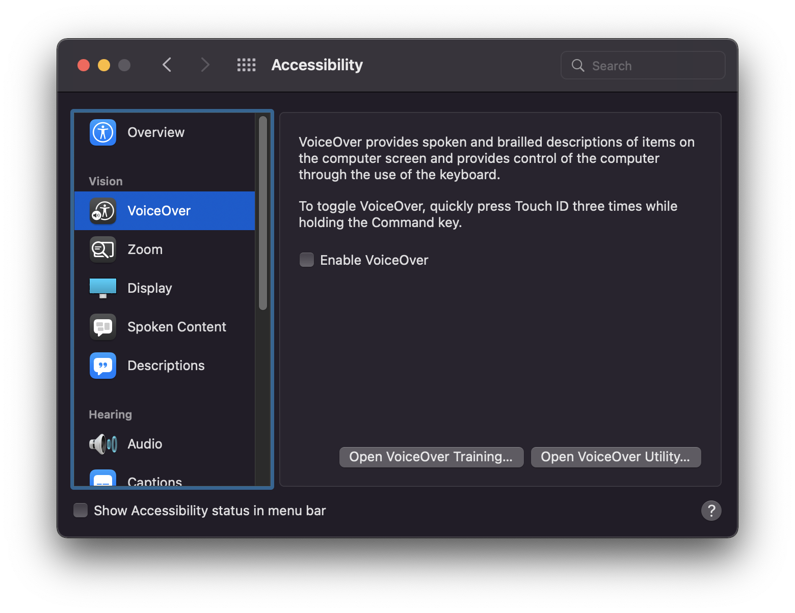
使用 Mac 上的 VoiceOver
Mac 上的 VoiceOver 就是一個相當完整的 Screen reader,只需到 System Preference -> Accessibility -> VoiceOver 即可啟用它。或者也可以使用快捷鍵「CMD + 點擊 3 下 TouchID」:
Accessible HTML
在學習下述這些屬性是非常建議參考已經實作好 a11y 的框架來搭配學習,例如 bootstrap。
Image
在使用 <img /> 標籤的時候盡可能搭配 alt 屬性,如果不知道要寫什麼,留空白也比不加好:
<!-- screen reader 會閱讀 alt 中的文字 -->
<img src="https://example.com/foo.jpg" alt="An example image" />

<!-- alt 留空字串的話 screen reader 會跳過該圖片 -->
<img src="https://example.com/foo.jpg" alt="" />

<!-- 沒有 alt 的話 screen reader 會惱人的把網址唸出來 -->
<img src="https://example.com/foo.jpg" />
Label
label @ MDN
label 除了可以最常搭配 input 使用外,實際上也可以作用在其他 "labelable" 的元素,例如 <button>、<select>、<textarea>、<meter>、等等...,可以進一步參考 Accessibility concerns @ MDN。
ARIA and roles
aria-label, aria-labelledby, aria-describedby
對於不能使用 label 但又希望能提供 screen reader label 功能的元素(或者對於沒有文字內容的 button),則可以使用 aria-label,例如:
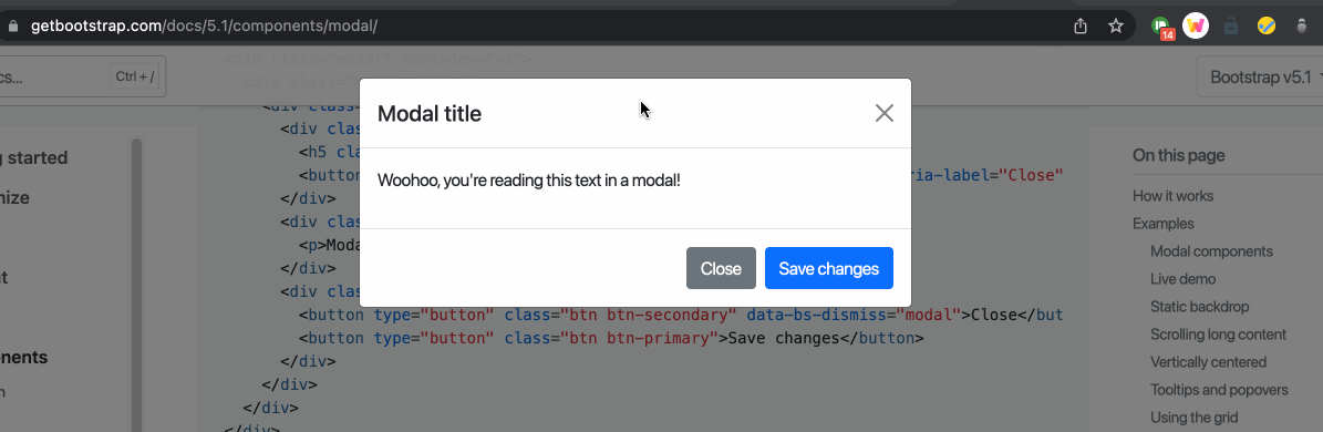
<button type="button" class="btn-close" data-bs-dismiss="modal" aria-label="Close"></button>
aria-label 和 aria-labelledby 的功能相同,但後者需要對應到某個 id,例如:
<div aria-labelledby="exampleModalLabel" tabindex="-1" aria-hidden="true">
  <div class="modal-dialog">
    <div class="modal-content">
      <div class="modal-header">
        <!-- aria-labelledby 對應到這裡的 id -->
        <h5 class="modal-title" id="exampleModalLabel">Modal title</h5>
        <button type="button" class="btn-close" data-bs-dismiss="modal" aria-label="Close"></button>
      </div>
      <div class="modal-body">...</div>
      <div class="modal-footer">...</div>
    </div>
  </div>
</div>
而 aria-labelledby 和 aria-describedby 的差別在於,describeby 通常是用來放一些延伸說明。
role attribute
瀏覽器�預設就已經針對不同 role 設定了不同相關的 accessibility 項目,所以如果我們真的需要把某些元素套用不同預設的 a11y 時,就可以擅用 role 這個屬性:
<!-- 讓 a 帶有 button 預設的 a11y 效果 -->
<p>
  This <a href="#" role="button">button</a> triggers a popover on click.
</p>
visually-hidden, visually-only-focusable
可以參考 Bootstrap visually hidden content 中的 visually-hidden 和 visually-hidden-focusable 這兩個 class 的實作。
在 Bootstrap v4 時,這兩個 class 是被稱作 sr-only 和 sr-only-focusable
有些頁面上的內容會希望從畫面中隱藏,但仍希望 scree readers 可以閱讀相關的資訊時,則可以使用 sr-only,例如用了額外說明顏色表示的訊息:
<!-- https://getbootstrap.com/docs/5.1/getting-started/accessibility/ -->
<p class="text-danger">
  <!-- 使用 sr-only 來提示視覺障礙的使用者這是須留意的操作 -->
  <span class="visually-hidden">Danger: </span>
  This action is not reversible
</p>
除了單純使用 visually-hidden 之外,如果希望某些元素是在 focus 是會顯示,但一般的時候不會顯示的話,則可以使用 visually-hidden-focusable:
<a class="visually-hidden-focusable" href="#content">Skip to main content</a>
這兩個 class 的實作是:
.visually-hidden,
.visually-hidden-focusable:not(:focus):not(:focus-within) {
    position: absolute!important;
    width: 1px!important;
    height: 1px!important;
    padding: 0!important;
    /* 透過 margin: -1px 把 width, height 各為 1px 的元素隱藏 */
    margin: -1px!important;
    overflow: hidden!important;
    clip: rect(0,0,0,0)!important;
    white-space: nowrap!important;
    border: 0!important;
}
Focus Management
Skip link
許多網站都會在網頁最上方提供 skip links 的功能,它的目的是讓鍵盤瀏覽網頁的使用者能夠避免要一直點擊 Tab 以跳過上方 header 或左側導覽列,才能進到主要內容。

要做 Skip link 可以直接參考 Bootstrap 的官方網站,基本上就是使用 visually-hidden-focusable 就能達到。
Keyboard & Tab Navigation
Keyboard @ MDN > WCAG Guidelines
在使用鍵盤瀏覽網站時,最基本的來說,使用 「Tab」 可以到下一個 tabbable item,使用 「Shift + Tab」 則可以到前一個 tabbable item。
但對於有選項後可以被展開的項目來說,後續則是使用「上下左右」鍵來操作:
對�於任何可以被鍵盤所 focused 的元素來說,它都應該要是有互動意義存在的,也就是說,如果這個元素能被 focused,它就應該要有額外可被互動,像是能夠打開其他連結、或展開下拉選單等等。
任何可以被點擊(clickable)或可互動的元素,也都應該要能被鍵盤所 focusable,並透過 keyboard event 讓它帶有互動上的意義。
對於預設不能被 focus 的元素,可以使用 tabindex 這個屬性(參考:TabIndex and Focus styles @ pjchender),但要確保這個 focusable 的元素有其互動上的意義(可能需要額外處理 keyboard event),同時記得要為它添加 :focus 的樣式。
<!-- https://learn-a11y.netlify.app/accessible-html/index.html -->
<div
  aria-label="Alert the word hello"
  tabindex="0"
  role="button"
  onclick="alert('hello')"
 onkeyup="alert('hello')"
>
 Click me!
</div>
Active Element
使用 document.activeElement 可以取得使用者目前 focus 的元素;使用 .focus() 則可以讓特定的「focusable 元素」被 focus:
const currentFocusElement = document.activeElement;

focusableElement.focus();
focusableElement.focus() 只能用在「能被 focus 的元素」上(包含使用了 tabindex="0" 的元素)。
Tab Trapping
Tab Trapping 的技巧常用在 Modal 中,在 Modal 中,使用者在操作鍵盤的時候,並不會 focus 到 Modal 以外的元素(雖然預設是可以的)。實作的方式可以是監控 Modal 中最後一個可被 focus 的元素,當使用者在該元素上點擊 Tab 時,則 focus 回 Modal 中的第一個元素。
如下圖所示,focus 的元素只會維持在 modal 內:
Visual Considerations
Dark Mode: Prefers Color Scheme
告知瀏覽器(User Agent)支援的色系:color-scheme
另外可以在 HTML 的 <meta> 告知瀏覽器這個網站支援了那些 color-scheme,瀏覽器也會借此調整 UA(User Agent)預設的樣式:
normal:頁面內的元素沒有針對 color-scheme 進行優化,因此會使用瀏覽器預設的 color-schemedark:頁面內的元素可以支援 OS 中的 dark modelight:頁面內的元素可以支援 OS 中的 light mode
<!-- 兩個都給表示兩個都支援,但更偏好前者 -->
<meta name="color-scheme" content="dark light">
類似的效果也可以寫在 CSS 的 :root,但由於 CSS 的解析通常需要在 HTML 之後,所以更偏好直接寫在 HTML 的 <meta> 中:
/* 亮/暗色都支援,但更偏好暗色 */
:root {
  color-scheme: dark light;
}
一般來說,可以直接把 User Agent(UA)當成瀏覽器的代名詞。
取得使用者系統偏好的主題:window.matchMedia + prefers-color-scheme
最重要的關鍵是使用 window.matchMedia('(prefers-color-scheme: dark)'); 來了解使用者在系統偏好設定中,是選擇的亮色或暗色主題:
const defaultTheme = window.matchMedia('(prefers-color-scheme: dark)').matches ? 'dark' : 'light';
也可以透過 checkbox 讓使用者切換主題:
/** query DOM elements */
const rootElem = document.querySelector('body.main');
const checkboxElem = document.getElementById('input');

/** get theme the user preferred */
const defaultTheme = window.matchMedia('(prefers-color-scheme: dark)').matches ? 'dark' : 'light';
let currentTheme = defaultTheme;

/** toggle the theme */
const handleToggleTheme = (e) => {
  if (e.target.checked) {
    currentTheme = 'dark'
  } else {
    currentTheme = 'light'
  }

  rootElem.setAttribute('data-theme', currentTheme);
}

const init = () => {
  checkboxElem.checked = currentTheme === 'dark';
  checkboxElem.addEventListener('change', handleToggleTheme);
  rootElem.setAttribute('data-theme', currentTheme);
}

init()
搭配 data-theme 和 CSS variable:
:root {
  --background: white;
  --text-primary: black;
  --text-secondary: royalblue;
  --accent: purple;
}

[data-theme='dark'] {
  --background: black;
  --text-primary: white;
  --text-secondary: grey;
  --accent: darkred;
}

.main {
  background: var(--background);
  color: var(--text-primary);
}

button {
  color: var(--text-primary);
  background-color: var(--background);
  border: 2px var(--text-primary) solid;
  float: right;
  transition: all .5s;
}
(Opt)設定亮暗主題時要套用的樣式:prefers-color-scheme
除了使用 data-theme 與 CSS variable 來達到切換主題配色的這種作法外,如果希望針對特定的主題樣式直接套用顏色是,可以使用 prefers-color-scheme 來設定亮/暗主題時所套用的樣式:
@media (prefers-color-scheme: dark) {
  /* 當使用者在系統中選擇的偏好是 dark mode 會被套用 */
  .wrapper {
    background: black;
  }
}

@media (prefers-color-scheme: light) {
  /* 當使用者在系統中選擇的偏好是 light mode 會被套用 */
  .wrapper {
    background: white;
  }
}
過去還有一�個屬性是 no-preference 但後來因為沒有任何瀏覽器加以實作它,所以已經從 spec 中移除。
Debug and Devtools
在 Chrome 開發者工具中,使用 CMD + Shift + P 叫出 Command Panel 後,搜尋「render」,在 render 面板中可以找到 "prefers-color-scheme" 的模擬功能:

其他
除了上述提到的 prefers-color-scheme,目前還可以透過 prefers-reduced-motion、prefers-contrast 來針對不同的系統偏好來套用不同的 CSS 樣式。
References
- Website Accessibility, v2 @ Frontend Master:這堂沒有很推XD
- Learn A11y
- a11ymatters
- Understanding the Web Content Accessibility Guidelines @ MDN