[SVG] 讓物體在原地旋轉
SVG 物體旋轉的時候是以 <svg></svg> 的左上角當作圓心進行旋轉,因此當我們直接對 svg 內的元素進行 rotate 時,常常不是我們想要的效果。若我們想要讓物體在原地進行選轉的話,可以使用一些技巧。

操作範例
可以搭配範例看下面的說明,SVG 原地旋轉 @ Codepen
STEP 0: 原本方形的位置
假設我們原本在 <svg></svg> 中畫一個方形:
<svg>
  <!--   原本方形的位置(400, 300)   -->
  <rect
    x="400"
    y="300"
    width="40"
    height="30"
    stroke="#41b883"
    stroke-width="2"
    fill="#41CEC0"
  ></rect>
</svg>
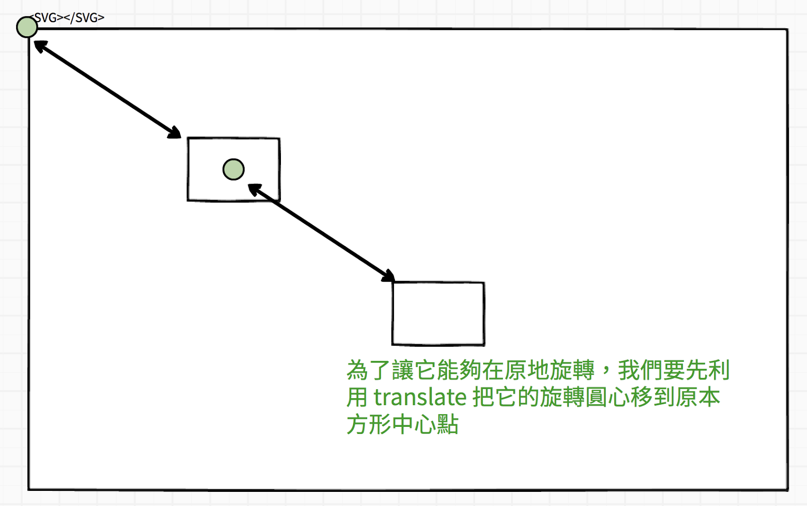
STEP 1: 先讓物體進行位移(translate)把圓心移到原物體中心點
為了讓這個方形能在原地旋轉,我們要把旋轉的圓心透過 translate 移動到方形的中心點:
我們可以計算出方形的中心點是:
// x' = x + width / 2
x' = 400 + 40 / 2 = 420
// y' = y + height / 2
y' = 300 + 30 / 2 = 315
因此我們可以寫 transform="translate(420, 315)"
<!--  STEP1: 先移動旋轉圓心的位置    -->
<!--   x' = x + width /2  -->
<!--   y' = y + height / 2   -->
<!--   translate(400 + 40/2, 300 + 30/2)   -->
<rect
  x="400"
  y="300"
  width="40"
  height="30"
  stroke="#41b883"
  stroke-width="2"
  fill="#41CEC0"
  transform="translate(420, 315)"
></rect>
STEP 2: 選擇想要旋轉的角度
接著看��你需要旋轉的角度,使用 rotate,在這裡我旋轉 45 度。
<!--   STEP2: 進行旋轉   -->
<!--   rotate(45)   -->
<rect
  x="400"
  y="300"
  width="40"
  height="30"
  stroke="#41b883"
  stroke-width="2"
  fill="#41CEC0"
  transform="translate(420, 315) rotate(45)"
></rect>
STEP 3: 將方形移回原本的位置
最後,我們一樣透過 translate ,把原本位移的距離在扣回去,就可以讓旋轉後的物體回到原本的位置:
<!--   STEP3: 移回原本的位置   -->
<!--   translate(-420, -315)   -->
<rect
  x="400"
  y="300"
  width="40"
  height="30"
  stroke="#41b883"
  stroke-width="2"
  fill="#41CEC0"
  transform="translate(420, 315) rotate(45) translate(-420, -315)"
></rect>
這樣就完成了原地旋轉。
其實如果你知道怎麼計算旋轉的中心點後,也可以一器合成的把它寫在 rotate 裡面,對多數人來說,這樣的作法也比較直觀好想像,我們只需要在 rotate(角度, 旋轉中心X, 旋轉中心Y) 裡面給定旋轉的中心點就可以了。
像是這樣子:
<!--   直接把旋轉中心點給在 rotate 之中   -->
<!--   rotate(45, 420, 315)   -->
<rect
  x="400"
  y="300"
  width="40"
  height="30"
  stroke="#41b883"
  stroke-width="2"
  fill="#41CEC0"
  transform=" rotate(45, 420, 315)"
></rect>
一樣可以達到原地旋轉的效果,但是如果你以後看到那種先位移再旋轉,之後再位移的作法,你也可以知道它背後的意義和邏輯了。