MUI Sandbox @ github
MUI 架構
Understanding MUI packages @ MUI v5
MUI Core
- Material UI(
@mui/material):使用基於 Material Design 所設計出來的元件,同時包含「功能」和「樣式」。 - MUI Base(
@mui/base):包含許多 Unstyled(headless)的 React UI 元件,只是用提供的「功能」,CSS 樣式的部分需要自己處理。 - MUI System(
@mui/system):相對於只用「功能」的 MUI Base,MUI System 則是提供許多 CSS Utilities 可以使用,特別像是sx,它需要搭配 MUI Base、MUI components 使用。
MUI System
MUI System @ MUI 5
sx
The sx prop @ MUI 5
MUI system 的 sx 特別適合用在一次性(one-ff)的元件。
一般使用
到 Properties 可以找到所有可以用的屬性名稱,以及可以直接使用到的 theme mapping,並且看 ${value} 的地方。
舉例來說:

- 如果寫
{ border: 3 },表示的即是border: 3px solid - 如果寫
{ borderColor: 'success.dark' },對應的會是theme.palette.success.dark的顏色 - 如果寫
{ gap: 3 },對應到的是theme.spacing(3) - 如果寫
{ display: 'inline-block' },因為這裡沒有任何 mapping(none),所以就是直接帶入該值 - 如果寫
{ fontFamily: 'fontFamily' },因為它的 mapping 是theme.typography[value],因此會套用theme.typography.fontFamily,表示會套用預設的 font family。
一般來說,搭配 <Box /> 使用 sx 是最簡單的方式:
<Box
  sx={{
    border: 1, // 1px solid
    bgcolor: 'background.paper', // bgcolor 的 "c" 是小寫,theme.palette.background.paper
    boxShadow: 1, // theme.shadows[1]
    borderRadius: 2, // theme.shape.borderRadius * 2
    p: 2, // theme.spacing(2)
    minWidth: 300, // 300px
    fontFamily: 'fontFamily', // theme.typography.fontFamily
  }}
/>
除了可以把上述的 System keys 放在 sx 中使用外,也可以把它們當成 <Box /> 的 props 帶入:
// 個人認為還是把 CSS 相關的屬性放在 `sx` 中集中管理比較好,和「功能」較相關的再用 props 傳下去。
<Box color="text.primary" fontSize={32} fontWeight="medium" fontFamily="fontFamily">
  98.3 K
</Box>
個人認為還是把 CSS 相關的屬性放在 sx 中集中管理比較好,和「功能」較相關的再用 props 傳下去。
callback value:需要使用到 theme 時
需要的話,sx 的「值」或「屬性值」都可以帶 callback function,特別適合用在需要使用 theme 的時候:
// 屬性值使用 callback
<Box
  sx={{
    height: (theme) => theme.spacing(2),
  }}
/>

// sx 的值使用 callback
<Box
  sx={(theme) => ({
    ...theme.typography.body1,
    color: theme.palette.primary.main
  })}
/>
Array values:特定情況下才套用特定樣式
<Box
  sx={[
    {
      '&:hover': {
        bgcolor: 'info.main',
        color: 'info.contrastText',
      },
    },
    checked && {
      '&:hover': {
        bgcolor: 'success.main',
        color: 'success.contrastText',
      },
    },
  ]}
>
  Array Values
</Box>
把 sx 當成 props 傳遞
Passing the sx prop @ MUI 5
- 定義型別的時候使用
SxProps<Theme>
// credit: https://mui.com/system/getting-started/the-sx-prop/#passing-the-sx-prop
import { SxProps, Theme } from '@mui/material/styles';

interface ListHeaderProps {
  children: React.ReactNode;
  sx?: SxProps<Theme>;
}

function ListHeader({ sx = [], children }: ListHeaderProps) {
  return (
    <ListItem
      sx={[
        {
          width: 'auto',
          textDecoration: 'underline',
        },
        // You cannot spread `sx` directly because `SxProps` (typeof sx) can be an array.
        ...(Array.isArray(sx) ? sx : [sx]),
      ]}
    >
      <FormLabel sx={{ color: 'inherit' }}>{children}</FormLabel>
    </ListItem>
  );
}
搭配 TypeScript 使用
如果你想要把套用到 sx 的物件存成一個變數使用,你「可能」需要搭配 as const:
const style = {
  bgcolor: 'background.paper', // bgcolor 的 "c" 是小寫
  boxShadow: 1,
  borderRadius: 2, // theme.shape.borderRadius * 1
  p: 2,
  minWidth: 300,
  flexDirection: 'column',
} as const;

<Box sx={style} />;
筆者實測沒有使用 as const 也沒有發生型別上的錯誤(2022.10.30)。
客製化(Customization)
MUI Playground @ code sandbox
Theme
createMuiTheme 是 material ui 4 的用法;createTheme 是 MUI 5 的用法。
查看 Default theme 可以知道所有可以覆蓋的預設樣式。
useTheme
在元件中,可以使用 useTheme 來取得 theme,或是用 theme 中提供的 utility,例如 theme.spacing()。
修改預設主題樣式
Theming @ MUI > Customization
使用 createTheme() 可以添加或修改預設的樣式,它會回傳一個新的 theme,接著只要把這個 theme 放到 <ThemeProvider> 中,即可套用新的主題樣式。
在 MUI 中,所有預設的樣式都列在 Default theme 中,可以找到欲改變的屬性並覆蓋即可。
舉例來說,如果想改變預設 primary 的樣式,在文件 Default theme 中可以看到它的屬性被放在 palette.primary 中:
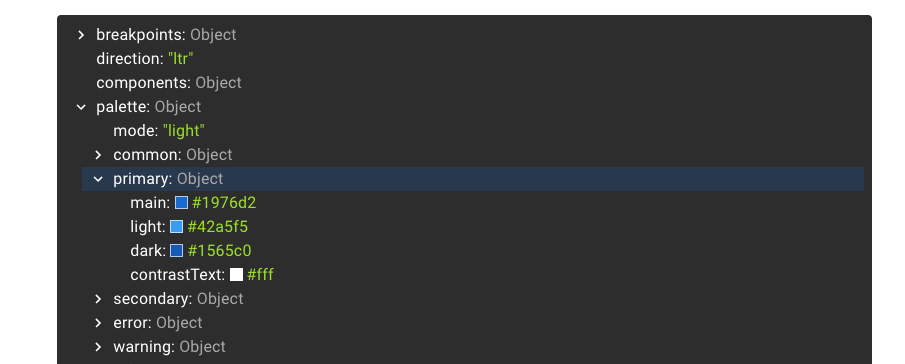
接著使用 createTheme 將該屬性的預設值覆蓋掉,並帶入 <ThemeProvider> 即可覆蓋掉預設的樣式:
import { orange } from '@mui/material/colors';
import { createTheme } from '@mui/material/styles';

export const theme = createTheme({
  // 修改預設的樣式
  palette: {
    primary: {
      main: orange[300],
      // light: MUI 會自動根據 main 來推算顏色
      dark: orange[500],
      // contrastText: MUI 會自動根據 main 來推算顏色
    },
  },
});

export default function CustomStyles() {
  return (
    <ThemeProvider theme={theme}>
      <CustomCheckbox defaultChecked />
    </ThemeProvider>
  );
在主題樣式中添加新的屬性(Custom variables)
透過 createTheme 也可以在 theme 中添加新的屬性。
舉例來說,如果想要在 theme 中添加一個 status.danger 的屬性,可以直接把該屬性放入 theme 的物件中:
export const theme = createTheme({
  // 添加新的屬性與樣式
  status: {
    danger: red[600],
  },
});
但如果需搭配 TypeScript 使用的話,由於預設在 theme 中沒有這個屬性,因此型別檢查會有問題,這時候可以使用 TypeScript 中的 Module Augmentation 來擴增 Theme 的型別定義:
// 透過 Module Augmentation 來擴增 Theme 的型別定義
// 這裡會在 Theme 中增添 `status.danger`

declare module '@mui/material/styles' {
  // 能夠在 theme 中找到這個屬性
  interface Theme {
    status: {
      danger: React.CSSProperties['color']; // 或用 string
    };
  }
  // 能夠透過 createTheme 新增屬性
  interface ThemeOptions {
    status: {
      danger: React.CSSProperties['color']; // 或用 string
    };
  }
}
如此,就可以在 theme 中取得自訂義的樣式:
import { Checkbox, styled } from '@mui/material';
import { useTheme } from '@mui/material/styles';

const CustomCheckbox = styled(Checkbox)(({ theme }) => ({
  color: theme.status.danger,
}));

function App() {
  const theme = useTheme();

  return (
    <div className="App">
      <CustomCheckbox />
      <span>{theme.status.danger}</span>
    </div>
  );
}
如果��使用 VSCode 的 auto import 要特別留意!styled 是從 @mui/material import 的,而不是從 '@emotion/styled' import 的。
Palette
在調色盤中的屬性可以在使用元件時,透過 color 來使用,包括新添加的屬性也可以。
例如:
<Button color="neutral" variant="contained">
修改調色盤中預設的色彩
Palette @ mui
在 MUI 中預設的調色盤(palette)包含:
- primary
- secondary
- error
- warning
- info
- success
每個調色盤中又包含:
- light
- main
- dark
- contrastText
透過前面提到的「修改預設主題樣式」可以修改它們的預設值,很酷的是「對於我們沒指定的屬性,MUI 會自動根據 main 來計算它們的顏色」,例如,如果我們只提供 palette.xxx.main 的話,MUI 會自動推算出 light、dark 和 contrastText 的顏色(計算的邏輯可以參考:Providing the colors directly)。
在調色盤中添加新的配色
Adding new colors @ MUI > Customization > Palette
一樣可以直接在 createTheme 的時候,將常用的配色添加到調色盤中:
export const theme = createTheme({
  palette: {
    // 添加新的配色
    neutral: {
      main: grey[500],
    },
  },
});
搭配 TypeScript 使用時,和修改 theme 一樣,可以透過 module augmentation 來擴增 TypeScript 的型別定義,主要是 Palette 和 PaletteOptions 避免 TS 找不到該屬性而報錯。
例如,這裡我們希望在添加 neutral 這個屬性在調色盤中:
import { grey } from '@mui/material/colors';
import { createTheme } from '@mui/material/styles';

declare module '@mui/material/styles' {
  // 能夠在 palette 中找到這個屬性
  interface Palette {
    neutral: Palette['primary'];
  }

  // 能用使用 createTheme 來設定這個屬性
  interface PaletteOptions {
    neutral?: PaletteOptions['primary'];
  }
}

export const theme = createTheme({
  // 在調色盤中添加新的屬性
  palette: {
    neutral: {
      main: grey[500],
      // MUI 會根據 main 自動計算出 dark, light, contrastText 的顏色
    },
  },
});
另外由於使用 palette 的元件並不知道 color 中又新的屬性可以使用(雖然是可以直接使用的),因此,同樣要擴增該元件的型別定義。
例如,雖然可以直接用 <Button color="neutral">,但因為 Button 元件並不知道 color 有 neutral 可以用,所以 TS 會報錯,這時候可以擴增 ButtonPropsColorOverrides 的型別:
import Button from '@mui/material/Button';

declare module '@mui/material/Button' {
  interface ButtonPropsColorOverrides {
    neutral: true;
  }
}

export default function CustomButton() {
  return (
    <Button color="neutral" variant="contained">
      Neutral
    </Button>
  );
}
Typography
Typography @ MUI
在 MUI 中,typography 共有 13 種不同的 variants,其中每個 variant 中可以調整的屬性可參考 Default theme:
- h1 ~ h6
- subtitle1, subtitle2
- body1, body2
- button:修改所有 Button 的文字樣式。
- caption
- overline
針對 TypeScript,如果希望增加 Typography 中的屬性,可以使用 module augmentation 來擴增 TypographyVariants 和 TypographyVariantsOptions 的型別;並且針對使用此 variant 的元件,使用 TypographyPropsVariantOverrides 來擴增。詳細作法參考官網的 Adding & disabling variants。
Spacing
Spacing @ MUI
修改預設值
MUI 預設的 spacing 的 base 是 8px,所以如果使用 theme.spacing(2) 表示 16px。
如果希望調整 spacing 的 base,一樣可以透過 createTheme 來修改,其中修改的參數可以是數值、函式、陣列等等,詳細差異與使用可直接參考官網。
theme.spacing:套用 margin 或 padding 時好用
theme.spacing() 這個函式最多可以吃 4 個參數:
theme.spacing(2); // '16px'
theme.spacing(1, 2); // '8px 16px';
theme.spacing(1, 'auto'); // '8px auto';
breakpoints
breakpoints @ MUI
修改預設值
如果希望修改 breakpoints 的預設值,一樣是透過 createTheme 來進行覆蓋,同樣可以參考 Default theme 中看可以覆蓋的屬性。
theme.breakpoints.xxx():需要用 media query 時好用
在 MUI 中,可以透過 theme.breakpoints.xxx() 來做到 media queries 的使用,其中包含 up、down、only、not、between 可以使用。
color
color @ MUI
可以直接 import color 來使用,可以用的顏色列在這個 Color palette 中:
// https://mui.com/material-ui/customization/color/
import { purple, red } from '@mui/material/colors';

const primary = red[500]; // #f44336
const accent = purple['A200']; // #e040fb
const accent = purple.A200; // #e040fb (alternative method)
How to customize
How to customize @ MUI
One-off customization
sx
- 使用
sx
Overriding nested component style:使用 xxxClasses
- 找到 nested component 的 class 加以覆蓋,例如 className 如果是
span.MuiSlider-thumb.css-ae2u5c-MuiSlider-thumb::after,重點是這個.MuiSlider-thumb,可以在sx中選到這個 class 加以覆蓋。 - 在 material UI 的元件中,有提供
xxxClasses可以 import 這個 className,以避免打錯字,例如,可以使用sliderClasses來針對 nested 的樣式進行覆蓋
// credit: https://mui.com/material-ui/customization/how-to-customize/#state-classes */

import { Slider, sliderClasses } from '@mui/material';

<Slider
  defaultValue={30}
  sx={{
    width: 300,
    color: 'success.main',
    // 選到 nester component 的 class
    // MuiSlider-thumb
    [`& .${sliderClasses.thumb}`]: {
      borderRadius: '1px',
    },
  }}
/>;
state classes
針對 MUI 中的狀態(例如,active、checked、disabled、error、...),可以使用 MUI 提供的 state classes,但在使用的時候要記得只針對特定的元件去做覆蓋,不要直接改全域的樣式。
同樣可以使用 xxxClasses 來取得該 className,避免手動打拼錯字。
/* credit: https://mui.com/material-ui/customization/how-to-customize/#state-classes */
/* ❌ NOT OK */
.Mui-error {
  color: red;
}

/* ✅ OK */
.MuiOutlinedInput-root.Mui-error {
  color: red;
}
Reusable Components
- reusable components @ mui
- styled @ mui
使用 styled(),來針對可複用的元件來調整樣式:
// credit: https://mui.com/material-ui/customization/how-to-customize/#2-reusable-component

import Slider, { sliderClasses, SliderProps } from '@mui/material/Slider';
import { alpha, styled } from '@mui/material/styles';

interface StyledSliderProps extends SliderProps {
  success?: boolean;
}

const StyledSlider = styled(Slider, {
  // 把希望能被 forward 的 prop 暴露
  shouldForwardProp: (prop) => prop !== 'success',
})<StyledSliderProps>(({ success, theme }) => ({
  width: 300,
  ...(success && {
    color: theme.palette.success.main,
    [`& .${sliderClasses.thumb}`]: {
      [`&:hover, &.${sliderClasses.focusVisible}`]: {
        boxShadow: `0px 0px 0px 8px ${alpha(theme.palette.success.main, 0.16)}`,
      },
    },
    [`&.${sliderClasses.active}`]: {
      boxShadow: `0px 0px 0px 14px ${alpha(theme.palette.success.main, 0.16)}`,
    },
  }),
}));

export default StyledSlider;
Components
theme-components @ MUI
default props
如果想要修改元件中 props 的預設值,可以在 createTheme 中透過 defaultProps 來修改:
export const theme = createTheme({
  // Components
  components: {
    // 元件的名稱
    MuiButtonBase: {
      defaultProps: {
        // 把 Button 預設 ripple 的行為關掉
        disableRipple: true,
      },
    },
  },
});
global style overrides
如果想要修改 MUI 中某一元件的樣式,可以使用 styleOverrides 這個屬性:
export const theme = createTheme({
  components: {
    // 元件的名稱
    MuiButton: {
      styleOverrides: {
        // 元件的 slot
        root: {
          fontSize: 32,
        },
      },
    },
  },
});
Overrides based on props
需要的話,透過 ownerState 可以取得該元件的 props,因此也可以根據 props 來套用不同的預設樣式:
export const theme = createTheme({
  components: {
    MuiSlider: {
      styleOverrides: {
        valueLabel: ({ ownerState, theme: _theme }) => ({
          ...(ownerState.orientation === 'vertical' && {
            backgroundColor: 'transparent',
            color: _theme.palette.grey[500],
            fontWeight: 700,
            padding: 0,
            left: '3rem',
          }),
          [`&.${sliderClasses.valueLabelOpen}`]: {
            transform: 'none',
            top: 'initial',
          },
        }),
      },
    },
  },
});
添加 variants
LEGACY (v4)
[LEGACY] Customization
[LEGACY] TS: 在 palette 中建立常用顏色
Adding new colors @ Material UI > Customization > Palette
也可以直接在 createMuiTheme 的時候,透過 palette 這個屬性把常用的顏色設定進去。但若搭配 TypeScript 使用,需要額外對 module 添加定義,否則 TypeScript 會因為找不到該屬性而報錯:
// 在 palette 中多一個 status 屬性
declare module '@material-ui/core/styles/createPalette' {
  interface Palette {
    status: {
      [key: string]: string;
    };
  }
  interface PaletteOptions {
    status: {
      [key: string]: string;
    };
  }
}

const theme = createMuiTheme({
  // ...
  palette: {
    text: {
      white: 'white',
      primary: '#616161', // rgb(97, 97, 97)
      secondary: '#212121', // rgb(33, 33, 33)
      hint: '#9e9e9e', // rgb(158, 158, 158)
    },
    // 客製化 status 的樣式
    status: {
      severe: '#a50f01', // 165, 15, 1
      mild: '#cb8700', // 203, 135, 0
      normal: '#424242', // 66, 66, 66
      unknown: '#bdbdbd', // 189, 189, 189
    },
  },
});
如此一樣可以透過在 makeStyles 時透過 theme 取得這些色碼。
[LEGACY] 使用 className 覆蓋樣式
一般來說,可以使用 makeStyles 搭配 useStyles 來覆蓋掉原本元件的樣式,例如:
import Button from '@material-ui/core/Button';
import { makeStyles } from '@material-ui/core/styles';

// STEP 1:使用 makeStyles 定義樣式
const useStyles = makeStyles((theme, props) => ({
  root: {
    backgroundColor: 'white',
  },
}));

const StyledButton = () => {
  // STEP 2:載入樣式
  const classes = useStyles();

  // STEP 3:透過 className 帶入樣式
  return <Button className={classes.root}>My Button</Button>;
};
[LEGACY] 使用 classes 覆蓋樣式
有些情況,對於階層比較深的元件,單純使用 className 可能無法覆蓋到底層的樣式,這時候可以 Material UI 元件中的 classes 屬性。在每一個 Material UI 的元件中,都會有該元件的 API 說明,在 API 文件中會有「CSS」的項目,告知可以哪些 CSS 是可以套用 classes 屬性來加以覆蓋。
舉例來說,在 Button API 中的 CSS 項目,有寫到 label:
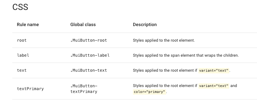
因此,就可以透過在 Button 元件的 classes 屬性中使用 label 來改變它的樣式:
<Button
  classes={{
    root: classes.root, // class name, e.g. `classes-nesting-root-x`
    label: classes.label, // class name, e.g. `classes-nesting-label-x`
  }}
>
  My Button
</Button>
[LEGACY] Styled Components API
- Styled Component API @ Styles > API
- Styled Component API @ Styles > Basics
- Adapting the Styled Components @ Styles > Basics
在 Material UI 中也有內建的 Styled Component API:
import { styled } from '@material-ui/core/styles';

const MyComponent = styled('div')({
  backgroundColor: 'red',
});

const MyThemeComponent = styled('div')(({ theme }) => ({
  padding: theme.spacing(1),
}));
Styled API 中單純只要用 props
若在 Styled API 中單純只要使用到該 component 的 props 的話,在後面的 () 中可以直接回傳物件,並在物件中透過 callback 的方式取出 props 來用:
interface MyButtonProps {
  color: 'red' | 'blue';
}

// 第二個 () 中直接回傳物件,並在其中使用 props
const StyledTableCell = styled(TableCell)({
  color: (props: MyButtonProps) => {
    console.log('props', props);
    return props.color as string;
  },
});

<StyledTableCell color="red" />;
Styled API 中同時使用 props 和 theme
⚠️ 這種做法還沒嘗試成功,雖然可以成功拿到 props 的資料,但 React 會一直出現警告:React does not recognize the
fooprop on a DOM element.
但如果不只是要使用 props 同時也需要使用 theme 的話,寫法不太一樣:
- 在第一個
()中,需要把客製化的 props 拿出來(在 TypeScript),把剩下的傳回原本的元件中 - 在第二個
()中,需要帶入回傳物件的函式,而在該函式的參數中可以取得該元件的 props 和 theme。同時,不能在回傳的物件中使用console.log():
// 第二個 () 中直接帶入函式,並透過函式的參數可以取得元件上的 props 和 theme
const StyledTableCell = styled(({ foo, ...other }) => <TableCell {...other} />)((props) => {
  const { foo, theme } = props as any;
  return {
    color: foo,
  };
});

<StyledTableCell foo="bar" />;
最後還是用回較單純的 Hook API 用法。
[LEGACY] Hook API
在 TypeScript 中需要先把該元件對應的 Type 載入,例如,這裡使用 <TableCell> 元件,則需要從同一個位置載入 TableCellProps 這個 Type,若沒有載入這個 Type 又使用了 material ui 對元件提供的 props 時,TypeScript 會報錯:
import TableCell, { TableCellProps } from '@material-ui/core/TableCell';
import { Omit } from '@material-ui/types';

const useTableCellStyles = makeStyles((theme, props) => ({
  tableCell: {
    color: ({ abnormalStatus }: { abnormalStatus: AbnormalStatus }) => {
      switch (abnormalStatus) {
        case AbnormalStatus.Severe: {
          return theme.palette.status.severe;
        }
        case AbnormalStatus.Mild: {
          return theme.palette.status.mild;
        }
        case AbnormalStatus.Normal: {
          return theme.palette.status.hint;
        }
        default: {
          return theme.palette.status.hint;
        }
      }
    },
  },
}));

interface InterfaceStyledTableCell {
  abnormalStatus: AbnormalStatus;
}

const StyledTableCell: React.FC<
  InterfaceStyledTableCell & Omit<TableCellProps, keyof InterfaceStyledTableCell>
> = ({ abnormalStatus, children, ...other }) => {
  const classes = useTableCellStyles({ abnormalStatus });
  return (
    <TableCell className={classes.tableCell} {...other}>
      {children}
    </TableCell>
  );
};

<StyledTableCell abnormalStatus={AbnormalStatus.Unknown} />;
💡 之前嘗試不用 Omit 一樣能正常運作,像是這樣:
React.FC<InterfaceStyledTableCell & TableCellProps。
[LEGACY] 建立可共用樣式的 className
keywords: createStyles, makeStyles
createStyles
如果想要在 makeStyles 中使用 theme,可以從 makeStyles 的第一個參數取得,其中 createStyles 的用途主要是針對 TypeScript,在 runtime 時並沒有任何效果:
// https://material-ui.com/styles/api/#createstyles-styles-styles
import { makeStyles, createStyles, Theme } from '@material-ui/core/styles';

const useStyles = makeStyles((theme: Theme, props) => createStyles({
  root: {
    backgroundColor: theme.color.red,
  },
}));

export default function MyComponent {
  const classes = useStyles();
  return <div className={classes.root} />;
}
makeStyles
// https://material-ui.com/styles/api/#makestyles-styles-options-hook
import React from 'react';
import { makeStyles } from '@material-ui/core/styles';

const useStyles = makeStyles({
  root: {
    backgroundColor: 'red',
    color: (props) => props.color,
  },
});

export default function MyComponent(props) {
  const classes = useStyles(props);
  return <div className={classes.root} />;
}
[LEGACY] TS: 在 theme 中添加其他客製化屬性(custom properties in theme with TypeScript)
theme 是直接套用在 CSS 的 value 而不能直接拿來當 className:
Customization of Theme @ Material UI > Guides > TypeScript
import { createMuiTheme } from '@material-ui/core';

declare module '@material-ui/core/styles/createMuiTheme' {
  // 能夠在 theme 中找到這個屬性
  interface Theme {
    utils: {
      [key: string]: number | string;
    };
  }
  // 能夠透過 createMuiTheme 新增屬性
  interface ThemeOptions {
    utils?: {
      [key: string]: {
        [key: string]: number | string;
      };
    };
  }
}

// 在主題中添加客製化樣式
const theme = createMuiTheme({
  //  spacing: 4,
  //  palette,
  //  typography,
  utils: {
    fz18: {
      fontSize: 18,
    }, // ...
  },
});
使用時有時需要搭配 as string:
// 因為 backgroundColor 只能是 string,但 theme.utils.color.danger 的 type 是 string | number
// 所以要加上 as string
const useCardStyles = makeStyles((theme) => ({
  cardHeader: {
    backgroundColor: ({ abnormalStatus }: { abnormalStatus: AbnormalStatus }) => {
      return theme.utils.color.danger as string
    }
  }
})
[LEGACY]在 makeStyles 中使用 animation
Do keyframe animations work? @ Github Issues
在 makeStyles 中可以使用 animation,但是:
- animation 需要定義在最外層
- 使用 animation 的地方,animation name 前面要加上
$
const useStyles = makeStyles((theme) => ({
  refreshButton: {
    marginLeft: 15,
    backgroundColor: theme.palette.grey[300],
    color: theme.palette.text.secondary,
    transitionDuration: '1s',
    transitionProperty: 'transform',

    // animation name 前面要加上 `$`
    '& svg': {
      animation: '$spin infinite 1.5s linear',
    },
  },
  // @keyframes 要定義在最外層
  '@keyframes spin': {
    '0%': {
      transform: 'rotate(360deg)',
    },

    '100%': {
      transform: 'rotate(0deg)',
    },
  },
});
Source Code
mui-materials
Material UI 的元件會放在 @material-ui/mui-materials。
mui-utils
裡面放了許多好用的 utils
useForkRef
useForkRef 可以接受兩��個 ref(例如 refA、refB),並會回傳一個接受 refValue 的 function,當執行這個 function 後,會同時把 refValue 設定到這兩個 ref 中,舉例來說:
const refA = useRef();
const refB = useRef();
const handleRef = useForkRef<HTMLInputElement>(refA, refB);

// handleRef 被呼叫時,會把 "some value" 設定到 refA 和 refB 中
handleRef('some value');
在 material UI 中,會使用 useForkRef 來將某個 DOM Node 同時保存在 forwardRef 的 ref 和該元件內部的 ref 中:
import useForkRef from './hooks/useForkRef';

// 透過 forward ref 將該元件的 ref 傳到外面
const FocusableTextInput = forwardRef<HTMLInputElement>((props, ref) => {
  // 該元件內部的 ref
  const inputRef = useRef<HTMLInputElement | null>(null);

  // handleRef 會是一個可以接受 value 的 function
  const handleRef = useForkRef<HTMLInputElement>(inputRef, ref);

  const handleClick = () => {
    inputRef.current?.focus();
  };

  return (
    <>
      {/* handleRef 執行時,會同時把這個 inputElement 保存在 ref 和 inputRef 中*/}
      <input type="text" ref={handleRef} />
      <button type="button" onClick={handleClick}>
        Click To Focus
      </button>
    </>
  );
});