[BS4] Bootstrap4 Customize Responsive Table(客制化表格寬度)
本文內容基於 Bootstrap 4,該版本已於 2023 年停止維護(EOL)。目前的穩定版本為 Bootstrap 5,Table 相關 class 有部分�變更(例如 .thead-dark 改為 class="table-dark" 套用於 <thead>)。新專案請改用 Bootstrap 5。
tags: table, table-responsive, customization
Table 是報表、數據等資料很常使用的程式方式。在 Bootstrap4 中 Table 的結構其實還蠻單純的,但是有些時候直接套用的表格卻不是這麼的「好看」,它會隨著內容的寬度而對每個欄寬造成不同的影響,進而使得版面變得不太好看,因此,讓我們來試著深入一些些瞭解 Bootstrap Table ,看可以做哪些操作,客制化成我們想要的好看表格。
這篇文章主要說明如何把 Bootstrap 的表格調整成自己想要的樣式,關於 Bootstrap 表格的基本架構可以參考中文官方文件。
以下內容建議搭配 範例程式碼 @ CodePen 閱讀。
基本架構
Bootstrap 4 表格的基本架構如下,其他 <th> 標籤可以搭配 scope 屬性使用,屬性值可以是 col, row, colgroup, rowgroup,主要是用來說明這個 th 是屬於某欄或某列的標頭。
另外,Bootstrap 4 還提供其他可套用的 class:
<table>:.table-dark,.table-sm,.table-striped,.table-bordered,.table-hover<thead>:.thead-light,.thead-dark<tr>,<td>:.table-active,.table-primary,.table-secondary,.table-success,.table-danger,.table-warning,.table-info,.table-light,.table-dark
HTML <th> scope Attribute @ w3schools
<!-- HTML -->
<table class="table">
  <thead>
    <tr>
      <th scope="col">#</th>
      <th scope="col">First Name</th>
      <th scope="col">Last Name</th>
      <th scope="col">Username</th>
    </tr>
  </thead>
  <tbody>
    <tr>
      <th scope="row">1</th>
      <td>Mark</td>
      <td>Otto</td>
      <td>@mdo</td>
    </tr>
    <tr>
      <th scope="row">2</th>
      <td>Jacob</td>
      <td>Thornton</td>
      <td>@fat</td>
    </tr>
    <tr>
      <th scope="row">3</th>
      <td>Larry</td>
      <td>the Bird</td>
      <td>@twitter</td>
    </tr>
  </tbody>
</table>
響應式表格
.table-responsive 的使用
要達到響應式表格,最直覺想到的是使用在 Bootstrap4 中提供 .table-responsive 這個 class 可以套用在 <table> 外層的 <div> 上:
<!-- HTML -->
<div class="table-responsive">
  <table class="table table-bordered table-striped">
    <caption>
      List of users
    </caption>
    <thead>
      <tr>
        <th scope="col">#</th>
        <!-- ... -->
        <th scope="col">Remark</th>
      </tr>
    </thead>
    <tbody>
      <tr>
        <th scope="row">1</th>
        <!-- ... -->
        <td>
          Lorem ipsum is placeholder text commonly used in the graphic, print, and publishing
          industries
        </td>
      </tr>
      <tr>
        <th scope="row">2</th>
        <!-- ... -->
        <td>
          Lorem ipsum is placeholder text commonly used in the graphic, print, and publishing
          industries
        </td>
      </tr>
    </tbody>
  </table>
</div>
一般來說只要 Table 內容相較於螢幕尺寸「太多」時,就會自動長出橫軸的 scroll-bar 讓使用者可以拖拉:

另外也提供不同尺寸的 .table-responsive 可以使用,如 .table-responsive-sm, .table-responsive-md, .table-responsive-lg, .table-responsive-xl,它們會在該尺寸以下時可以左右滾動;該尺寸以上時則無法(使用的是 max-width)。
以 .table-responsive-md 為例,當螢幕尺寸 <768px 時,只要表格內容多過螢幕尺寸,就會出現水平捲軸可以滾動;當螢幕尺寸 >= 768px 時,這個水平的滾動捲軸就會消失。
.table-responsive 的作用
從 Bootstrap 的原始碼中,可以看到 .table-responsive 的主要作用是把表格變成 display: block;,當寬度超過時,就以 overflow-x: auto; 來出現水平捲軸:
/* .table-responsive 的作用 */
.table-responsive {
  display: block;
  width: 100%;
  overflow-x: auto;
  -webkit-overflow-scrolling: touch;
  -ms-overflow-style: -ms-autohiding-scrollbar;
}
.table-responsive 不足之處
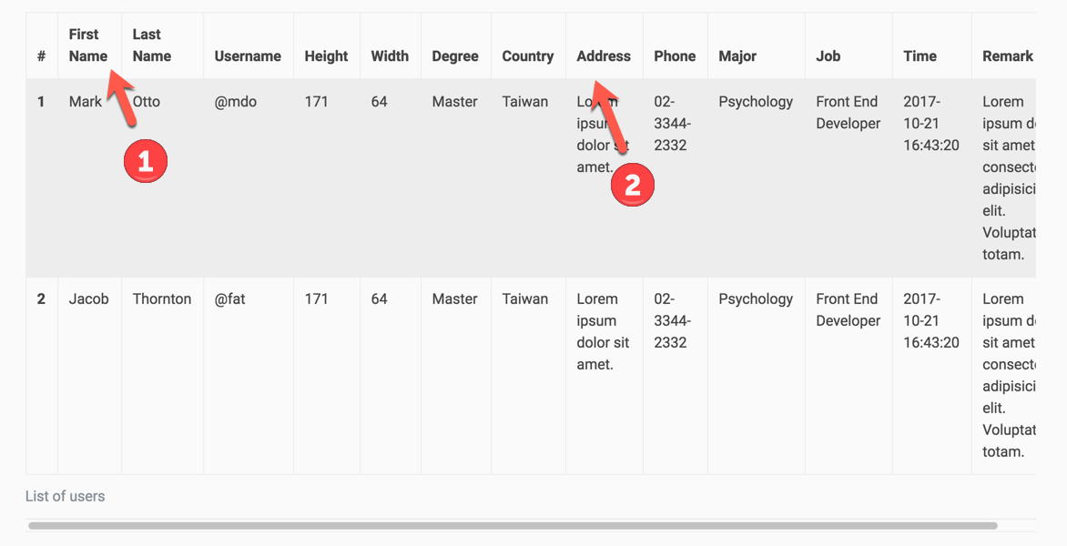
然而,這個基本的 responsive-table 在實際使用上有一些不方便之處,如下圖所示:
- 有些表格的標頭會自己換行
- 每個欄的寬度不同,看起來不整齊,而且有些欄當中的內容較多時,會一直換行
解決文字換行的問題
第一個問題比較容易解決,可以用 Bootstrap 中提供的 .text-nowrap 來避免表格欄位標頭換行即可。
<th scope="col" class="text-nowrap">First Name</th>
<th scope="col" class="text-nowrap">Last Name</th>
客制化表格(Customization Bootstrap Table)
第二個問題則需要透過客制化的表格來處理,根據實際的內容調整表格寬度,做出最合適的表格:
- 在原本的
.col這行加上.custom-table-width(名字可以自己取),並且設為overflow-x: auto;:
<!-- HTML -->
<div class="col custom-table-width">
  <table class="table">
    ...
  </table>
  <div></div>
</div>
.custom-table-width {
  overflow-x: auto;
  ...;
}
2.雖然設定了 overflow: auto;,但是原本在 .col 中預設 padding 的空間一樣會顯示內容出來,造成表格的寬度和上下文的寬度有 15px 的差異,因此我們需要使用 margin 把原本左右的空間推回來:
// SCSS
$grid-gutter-width: 30px;

.custom-table-width {
  overflow-x: auto;
  margin-right: $grid-gutter-width / 2; // 利用 margin 推回去原本 padding 的空間
  margin-left: $grid-gutter-width / 2;
  padding-right: 0;
  padding-left: 0;
}
Bootstrap 預設的 padding 寬度是 15px ,也就是欄間距(gutters)除以 2 的寬度(
$grid-gutter-width / 2)。
3.可以把 .table-responsive 拿掉,因為裡面的 display: block 屬性可能使得表格無法按照給定的寬度顯示。 4.將 .table 設定 table-layout 和 min-width 。
table-layout 的預設值是 auto,也就是表格和細格(cell)的寬度會根據內容而改變;為了要讓表格根據所設定的值而改變,要設成 fixed,設定後表格的各欄寬度就會相同。另外,為了確保字不會疊在一起,或不斷換行,需要為表格設定最小寬度(min-width),這裡可以根據表格內容多寡設定一個適合的最小寬度:
.table {
  table-layout: fixed; // 表格和欄寬將根據所給定的寬度來顯示
  min-width: 1440px; // 避免因寬度不足而字疊在一起(根據表格內容設定寬度)
}

設定了
table-layout: fixed後,表格各欄就會等寬(table-layout @ MDN)。
5.最後要設定表格中各欄的寬度,這裡一種作法是直接在 <th width="10%"> 加上 width 屬性,但 MDN 並不建議這種作法,因為 width 屬性在 HTML 5 中已被移除,建議還是在 CSS 中定義各欄寬,寬度可以設定%, px, em, rem 等等都可以,如果想要給到比較精確的話可以使用 px 或 em/rem:
HTML th element @ MDN
// 流水號 #
thead th:first-child,
tbody td:first-child {
  width: 2em;
}

// Time
thead th:nth-child(10),
tbody td:nth-child(10) {
  width: 13em;
}

// Remark
thead th:last-child,
tbody td:last-child {
  width: 20%;
}
��完整範例程式碼
HTML
<!-- HTML -->
<div class="container">
  <div class="row">
    <div class="col custom-table-width">
      <h4>Table with custom width</h4>
      <table class="table table-bordered table-striped">
        <caption>List of users</caption>
        <thead>
          <tr>
            <th scope="col">#</th>
            <th scope="col">First Name</th>
            <th scope="col">Last Name</th>
            <th scope="col">Username</th>
            <th scope="col">Height</th>
            <th scope="col">Width</th>
            <th scope="col">Degree</th>
            <th scope="col">Country</th>
            <th scope="col">Major</th>
            <th scope="col">Time</th>
            <th scope="col">Remark</th>
          </tr>
        </thead>
        <tbody>
          <tr>
            <th scope="row">1</th>
            <td>Mark</td>
            <td>Otto</td>
            <td>@mdo</td>
            <td>171</td>
            <td>64</td>
            <td>Master</td>
            <td>Taiwan</td>
            <td>Psychology</td>
            <td>2017-10-21 16:43:20</td>
            <td>Lorem ipsum is placeholder text commonly used in the graphic, print, and publishing industries </td>
          </tr>
          <tr>
            <th scope="row">2</th>
            <td>Jacob</td>
            <td>Thornton</td>
            <td>@fat</td>
            <td>171</td>
            <td>64</td>
            <td>Master</td>
            <td>Taiwan</td>
            <td>Psychology</td>
            <td>2017-10-21 16:43:20</td>
            <td>Lorem ipsum is placeholder text commonly used in the graphic, print, and publishing industries </td>
          </tr>
          <tr>
            <th scope="row">3</th>
            <td>Larry</td>
            <td>the Bird</td>
            <td>@twitter</td>
            <td>171</td>
            <td>64</td>
            <td>Master</td>
            <td>Taiwan</td>
            <td>Psychology</td>
            <td>2017-10-21 16:43:20</td>
            <td>Lorem ipsum is placeholder text commonly used in the graphic, print, and publishing industries </td>
          </tr>
        </tbody>
      </table>
    </div>
  </div>
</div>
SCSS
// 定義各欄位的寬度
$grid-gutter-width: 30px;
.custom-table-width {
  overflow-x: auto;
  margin-right: $grid-gutter-width / 2; // 利用 margin 推回去原本 padding 的空間
  margin-left: $grid-gutter-width / 2;
  padding-right: 0;
  padding-left: 0;

  .table {
    table-layout: fixed; // 表格和欄寬將根據所給定的寬度來顯示(預設等寬)
    min-width: 1440px;   // 避免因寬度不足而字疊在一起
  }

  // 流水號 #
  thead th:first-child,
  tbody td:first-child {
    width: 2em;
  }

  // Time
  thead th:nth-child(10),
  tbody td:nth-child(10) {
    width: 13em;
  }

  // Remark
  thead th:last-child,
  tbody td:last-child {
    width: 20%;
  }
}
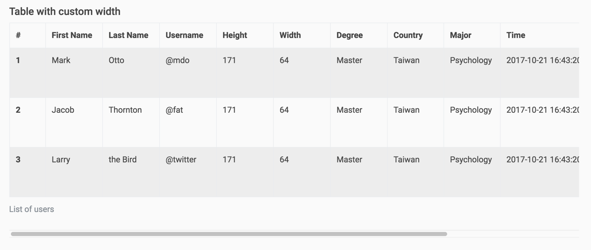
如此就可以客制化出自己想要的表格寬度和欄寬:
其他客制化內容
表格內容垂直置中
.table th,
.table td {
  vertical-align: middle;
}
標頭邊框寬
當我們使用 .table-bordered 時,會發現標頭 <thead> 和 <tbody> 之間的邊框稍微比較寬一些,這是因為在 Bootstrap 中預設標頭的邊框底寬是 2px ,如果你希望它的寬度不要不一樣,可以使用:
.table-bordered thead th,
.table-bordered thead td {
  border-bottom-width: 1px;
}

關於本文若有錯誤,敬請告知,避免錯誤或不正確的資訊傳播。若有其他建議的作法,也歡迎告知一同討論。
延伸閱讀
- Styling Tables @ MDN
- HTML Table @ MDN