[npm] Storybook
本文部分內容基於 Storybook v6/v7。Storybook v8(2024 年發布)有多項破壞性變更:start-storybook/build-storybook CLI 改為 storybook dev/storybook build、@storybook/addon-storyshots 已移除(改用 @storybook/test-runner)、@storybook/testing-react 已棄用(改用內建 composeStories)、@storybook/testing-library 改為 @storybook/test、ComponentMeta/ComponentStory 型別改為 Meta/StoryObj(CSF3)。
storybook/examples @ github
這篇內容混雜了 CSF3(meta) 和 CSF2(ComponentMeta)的寫法,請讀者特別留意。
TL;DR
# storybook 會檢視專案中相依的套件,自動提供最合適的設定檔
$ npx sb init
$ npx sb upgrade

$ npm run storybook
$ npm run storybook --  --no-manager-cache  # clear cache in the Storybook

# 如果想要檢視專案所吃到的 webpack 設定
$ npx start-storybook --debug-webpack # develop
$ npx build-storybook --debug-webpack # production
- 如果有使用到 react-docgen 這個 addon,建議元件使用 named export 以避免未預期的錯誤,例如,沒辦法自動解析元件的 props、沒辦法自動產生 action、被 styled-component 影響而無法正確解析 props 等等。可以參考 Nothing shows up, this is broken!。
args可以把 props 帶入 component 中parameters可以改變 addon 的設定decorators可以在 component 外再包一層 wrapper
撰寫 Story
- How to write stories @ Writing Stories
- Component Story Format @ API > Stories
基本
使用 Component Story Format (CSF) 的方式來撰寫 storybook 中的 story,所謂 CSF 的方式是指透過 ES Modules 的方式來定義 stories 和 component metadata,每一個元件的 .stories 檔中都包含 default export 和多個 named exports:
- default export 會用來控制 Storybook 如何列出 stories,並且提供 addons 所需的資訊
- named exports 則用來定義個別的 story,預設的情況下,export 的名稱就會是該 Story 的名稱。
使用 default export 來描述 component;使用 named exports 來描述 stories。一個 Component 下可以有多個 Stories。
// https://storybook.js.org/docs/react/writing-stories/introduction

import type { Meta, StoryObj } from '@storybook/react';

import { Button } from './Button';

const meta: Meta<typeof Button> = {
  title: 'Example/Button', // optional
  component: Button,
};

// 一個 component 有一個 default export
export default meta;

type Story = StoryObj<typeof Button>;

// 一個 named export 對應一個 story
export const Primary: Story = {

  // 雖然這裡示範使用 render,但比較常見的方式是使用後面說明的 args
  render: () => <Button primary label="Button" />,

  // 改變 story 的名稱
  name: 'change a new name',
};

Storybook 中的元件顯示的名稱與排序
- Naming components and hierarchy @ Write stories
- Sidebar & URLS @ Configure > User interface
顯示名稱
default exports 中的 title 會影響到 Storybook 中側邊欄的名稱。如果需要用「資料夾」的概念來將多個 .stories 做分類,可以在 title 中使用 /,例如下面的 title:
// component level
const meta: Meta<typeof Button> = {
  title: 'Example/Components/Foobar/Button',
  component: Button,
};

export default meta;

// story level
export const Primary = Template.bind({});
export const Secondary = Template.bind({});
export const Large = Template.bind({});
export const Small = Template.bind({});
Small.storyName = 'Small Button';
會長出 storybook 對應的側邊欄,可以看到 EXAMPLE、Components、Foobar、Button 這之間的階層關係:

但有一個特殊的情況是 Single story hoisting,如果
- 這個 component(
.stories檔)中只有一個 Story - 這個 Story 的名稱(即,named export 的名稱)和 component 的
title相同
則之後顯示 component level,就不會再巢狀下去。
排序
Sorting Stories @ Writing Stories > Naming components and hierarchy
預設的情況下,stories 會以它們被 import 的順序來排序,如果需要修改的話,可以透過 preview.js 中的 storySort 來改變,例如:
// .storybook/preview.js

export const parameters = {
  options: {
    // 可以帶入函式
    // storySort: (a, b) => {/* implement the sort logic */}
    // 也可使用物件的方式設定
    storySort: {
      method: '',
      order: [],
      locales: '',
    },
  },
};
args:改變 component 的 props
Args @ Writing Stories > Args
args 會是帶入該元件的 props,可以設定在 component(stories) 或 story 層級。 當 args 改變時,component 就會重新 render。
透過 args 的使用,可以讓:
- 讓該元件的 arguments / props 可以在 Control tab 中動態的被修改
- 讓該元件的行為(例如,click)在 Actions tab 中被紀錄
args 可以設定在 component level,也可以設定在 story level。
Component Level args
設定在 component (stories) 層級,如此它會套用在所有的 stories 上,除非有被覆蓋:
// https://storybook.js.org/docs/react/writing-stories/args
import type { Meta } from '@storybook/react';

import { Button } from './Button';

const meta: Meta<typeof Button> = {
  component: Button,
  //👇 Creates specific argTypes
  argTypes: {
    backgroundColor: { control: 'color' },
  },
  args: {
    //👇 Now all Button stories will be primary.
    primary: true,
  },
};

export default meta;
type Story = StoryObj<typeof Button>;
Story Level args
接著,針對不同的 stories 則使用 args 來修改,也可也搭配 object destructuring 來重複使用這些 args:
// ...

export default meta;
type Story = StoryObj<typeof Button>;

export const Primary: Story = {
  args: {
    primary: true,
    label: 'Button',
  },
};

export const Secondary: Story = {
  args: {
    label: 'Button',
  },
};

export const Large: Story = {
  args: {
    ...Primary.args,
    size: 'large',
    label: 'Button',
  },
};

export const Small: Story = {
  args: {
    ...Primary.args,
    size: 'small',
    label: 'Button',
  },
};
當 args 的欄位太過複雜,沒辦法透過 controls addon 來控制或與 URL 同步時,可以使用 argTypes 搭配 mapping 來使用,通常絕大部分是用在 select 這類型的元件:
export default {
  component: MyComponent,
  argTypes: {
    label: {
      options: ['Normal', 'Bold', 'Italic'],
      mapping: {
        Bold: <b>Bold</b>,
        Italic: <i>Italic</i>,
      },
    },
  },
};
parameters:改變 addon 的設定
layout:調整 story 的呈現的位置,包括centered、fullscreen和padded。參考 Story Layout。
大部分的 addons 都可以透過 parameter 來進行設定,且這個設定可以被套用到 global 上(設定在 .storybook/preview.js)、套用到多個 stories 上(使用 default export)、或是套用到單一個 story 上(使用 named export)。
不同層級間的 parameter 會以 merged 的方式被處理,因此父層的 parameter 會被子層中相同的屬性覆蓋,但對於父層中那些沒被覆蓋到的屬性是不會被移除的。
例如,可以使用 parameters.backgrounds 來改變每個 Button 的 stories 中 canvas 可被選擇的背景顏色:
// component level parameter
const meta: Meta<typeof Button> = {
  title: 'Example/Button',
  component: Button,

  parameters: {
    // https://storybook.js.org/docs/react/configure/story-layout
    layout: 'centered', // centered, fullscreen, padded

    // 改變 background 可以被選擇的顏色(預設是 light 和 dark)
    backgrounds: {
      values: [
        { name: 'red', value: '#f00' },
        { name: 'green', value: '#0f0' },
        { name: 'blue', value: '#00f' },
      ],
    },
  },
};

export default meta;
原本預設是 light 和 dark,修改後則是 red、green 和 blue 可以選擇:

也可以定義 global level 的 parameters:
// .storybook/preview.js

// global level parameters
export const parameters = {
  actions: { argTypesRegex: '^on[A-Z].*' },
  controls: {
    matchers: {
      color: /(background|color)$/i,
      date: /Date$/,
    },
  },
};
decorators:component wrapper
Nested container components @ storybook > tutorials
decorators 可以作為這個 story 外層的 wrapper,像是 theme wrapper、layout wrapper、state provider 等等,它一樣可以設定要套用到 global 上(設定在 .storybook/preview.js)、套用到多個 stories 上(使用 default export)、或是套用到單一個 story 上(使用 named export)。
decorators 的第二個參數可以取得 story context,在 story context 中可以取得:args、argTypes、globals、hooks、parameters、viewMode。
Styles(extra markup)
舉例來說,可以透過 decorators 在每個 Button 的 stories 外添加樣式:
// Button.stories.tsx

// component level
const meta: Meta<typeof Button> = {
  title: 'Example/Button',
  component: Button,
  decorators: [
    (Story) => (
      <div style={{ margin: '3rem' }}>
        <Story />
      </div>
    ),
  ],
};

export default meta;

// story level
const Template: ComponentStory<typeof Button> = (args) => <Button {...args} />;
export const Primary = Template.bind({});
Primary.decorators = [
  (Story) => (
    <div style={{ margin: '3rem' }}>
      <Story />
    </div>
  ),
];
ThemeProvider(Context)
寫在 .storybook/preview.js 中的設定則會套用在整個 storybook 中:
// .storybook/preview.js
import { ThemeProvider } from 'styled-components';

// global level decorator
export const decorators = [
  (Story) => (
    <ThemeProvider theme="default">
      <Story />
    </ThemeProvider>
  ),
];
Redux
除了樣式之外,如果專案中有用到 Redux 也同樣適用。舉例來說,InboxScreen 這個元件中會用需要用到來自 Redux 的資料,因此在 Storybook 中使用它時,會需要把它包在 Provider 中:
- 建立一個 mock 的 redux store
- 透過
@storybook/addon-actions可以模擬 redux 的 dispatch 函式 - 在
decorators中把元件用<Provider />包起來
import { action } from '@storybook/addon-actions';
import { Provider } from 'react-redux';

import * as TaskListStories from '../TaskList/TaskList.stories';
import { PureInboxScreen } from './InboxScreen';

// mock 一個非常簡單的 redux store
const store = {
  getState: () => ({ tasks: TaskListStories.Default.args.tasks }),
  subscribe: () => 0,
  dispatch: action('dispatch'), // 使用 action addon
};

export default {
  component: PureInboxScreen,
  // 在 decorators 中把元件用 Provider 包起來,並把 mock 的 store 帶進去
  decorators: [(story) => <Provider store={store}>{story()}</Provider>],
  title: 'InboxScreen',
};

const Template = (args) => <PureInboxScreen {...args} />;

export const Default = Template.bind({});

export const Error = Template.bind({});
Error.args = {
  error: 'Something went wrong',
};
Play function
- Play function @ Storybook > Write Stories
- Interaction tests @ Storybook > Testing
play function 是會在 story render 前執行的程式碼片段,讓你可以模擬使用者操作一般來和元件互動和執行測試,例如,表單驗證。建議使用 play function 前先安裝 Storybook 的 @storybook/addon-interactions,使用前可先參考設定方式。
對於一般的元件,可以直接使用 testing-library 提供的 query 方法(參考:React Testing Library 的一些實用的小技巧)來找到元素,例如:
// https://storybook.js.org/docs/react/writing-stories/play-function#writing-stories-with-the-play-function
import { userEvent, screen } from '@storybook/testing-library';

export const FilledForm = Template.bind({});
FilledForm.play = async () => {
  // fill in the email field
  const emailInput = screen.getByLabelText('email', {
    selector: 'input',
  });
  await userEvent.type(emailInput, 'example-email@email.com', {
    delay: 100,
  });

  // fill in the password field
  const passwordInput = screen.getByLabelText('password', {
    selector: 'input',
  });
  await userEvent.type(passwordInput, 'ExamplePassword', {
    delay: 100,
  });

  // select some item
  const selectElements = screen.getByRole('listbox');
  await userEvent.selectOptions(selectElements, ['Taiwan']);

  // click the submit button
  const submitButton = screen.getByRole('button');
  await userEvent.click(submitButton);

  // should see the DOM with testId "error"
  await waitFor(async () => {
    userEvent.hover(screen.getByTestId('error'));
  });
};
在 testing-library 中可以使用 fireEvent 和 userEvent 來促發事件,相較之下,userEvent 更能夠模擬使用者的行為。
預設的情況下,play function 會從 canvas 的 top-level element 開始執行,但是當渲染的是比較複�雜的元件時(例如,form 或 page),可以透過 within(canvasElement) 讓它從 component 的 root 開始執行,以獲得更好的效能:
// https://storybook.js.org/docs/react/writing-stories/play-function#working-with-the-canvas
// ...

import { userEvent, within } from '@storybook/testing-library';

export const ExampleStory = Template.bind({});
ExampleStory.play = async ({ canvasElement }) => {
  // Assigns canvas to the component root element
  const canvas = within(canvasElement);

  // Starts querying from the component's root element
  await userEvent.type(canvas.getByTestId('example-element'), 'something');
  await userEvent.click(canvas.getByRole('another-element'));
};
使用 MDX 撰寫 Story
MDX @ Storybook > Writing Docs
在 Storybook 中,可以使用 xxx.stories.mdx 來:
- 同時撰寫 Story 和 DocsPage
- 單純建立一份文件
在 Storybook 中,可以使用 MDX 來達到原本使用 CSF 來撰寫 Story 的所有功能(即,原本使用 JSX/TSX 搭配 default export 和 named export),而且這些功能都有一對一的對應。
使用 MDX 來撰寫文件雖然很方便,但多數 IDE 對於 MDX 的支援度不高,所以如果你在 MDX 中試圖使用某些未被 import 的變數,或是有語法上的錯誤,IDE 都沒有辦法直接提示你,且有可能要重啟 Storybook 的時候才能在 log 中看到錯誤。
單純建立一份文件
Documentation-only MDX @ Storybook > Write Docs > MDX
如果你只是單純想要在 Storybook 中建立一份說明文件,這應該是最簡易的方式。
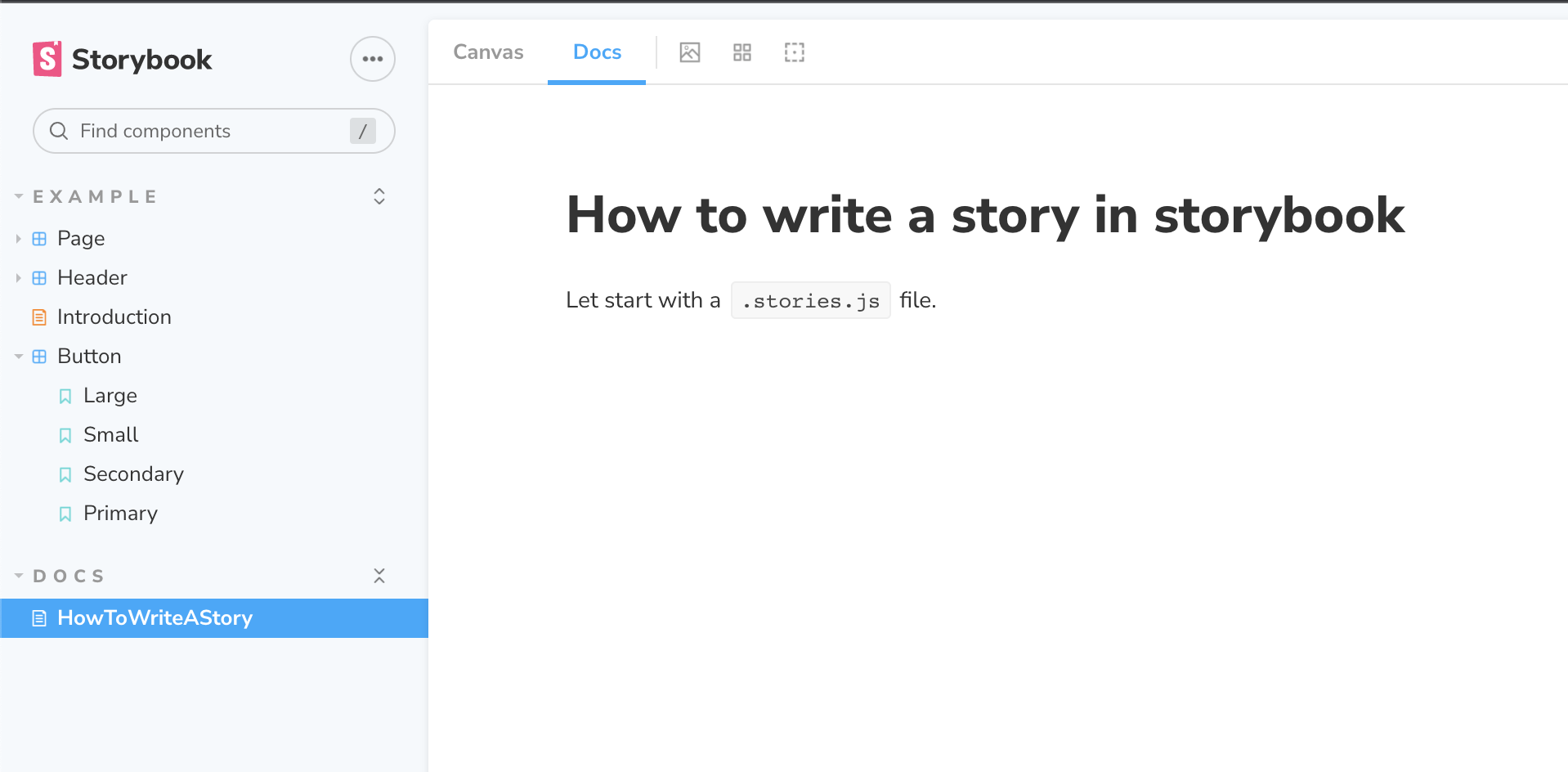
如果你只是想要在側邊欄多一個文件的目錄,但這份文件中並不會有任何 Story 的話,你可以使用 .stories.mdx 來達到,Storybook 預設就會去爬 xxx.stories.mdx 的檔案,記得要透過 <Meta title="..." /> 來定義該文件側邊欄顯示的名稱,如此 Storybook 就會產生出這份對應的文件:
// HowToWriteAStory.stories.mdx

import { Meta } from '@storybook/addon-docs';

<Meta title="Docs/HowToWriteAStory" />

# How to write a story in storybook

Let start with a `.stories.js` file.
記得要在 xxx.stories.mdx 中使用 <Meta /> 來達到類似原本使用 JSX/TSX 來寫 stories 時 default export 的效果,如此才會在側邊欄看到該份文件。
如此就會將這份 MDX 產生出對應的內容:
- 可以看到這份文件放在
DOCS區塊內,名稱為HowTwoWriteAStory - 右邊預設就會用 Docs 來顯示,且因為 MDX 中並沒有使用
<Story />,所以即使切換到 Canvas 頁籤時,依然只會看到文件
同時撰寫 Story 和 DocsPage
如果需要改變 DocsPage 中文件的內容,除了可以使用 parameters.docs.page 參數,指定特定的內容來顯示在 DocsPage 中,Storybook 也支援使用 MDX 的方式直接定義出 .stories 檔和 DocsPage 的內容。
如果單純只是想在 Storybook 中建立一份文件,而沒有實際 component 的 story,一樣可以使用.stories.mdx 的檔案來建立文件(參考上一個段落 — 單純建立一份文件)。
具體來說,開發者可以建立 xxx.stories.mdx 的檔案,Storybook 會去抓取在這個 MDX 中:
- 將文件中使用到
<Story />的部分,顯示在該 Story 的 Canvas 頁籤中 - 把整份 MDX 的內容顯示在該 Story 的 DocsPage 頁籤中
舉例來說,當我們寫出下面的 MDX 時:
<Meta />中的資訊可以想成是原本用 JSX/TSX 寫 stories 時,default export 中告知 storybook 的資訊<Story />是要顯示出來的 Story 元件,也就是原本用 JSX/TSX 寫 stories 時 named export 的元件- 如果需要在同一個區塊內顯�示多個 Story,則需要使用
<Canvas />把多個<Story />包起來,要留意 Story 之間不要有額外的空行或換行
// Button.stories.mdx

import { Canvas, Meta, Story } from '@storybook/addon-docs';

import { Button } from './Button';

<Meta
  title="Example/Button"
  component={Button}
  parameters={
    {
      /* ... */
    }
  }
  decorators={
    [
      /* ... */
    ]
  }
/>

export const Template = (args) => <Button {...args} />;

# Button

With `MDX`, we can define a story for `Button` right in the middle of our
Markdown documentation.

We can define it in a `Canvas` to get a code snippet:

<Canvas>
  <Story
    name="Primary"
    args={{
      primary: true,
      label: 'Button',
    }}
  >
    {Template.bind({})}
  </Story>
  <Story
    name="Secondary"
    args={{
      label: 'Button',
    }}
  >
    {Template.bind({})}
  </Story>
  <Story
    name="Small"
    args={{
      label: 'Button',
      size: 'small',
    }}
  >
    {Template.bind({})}
  </Story>
  <Story
    name="Large"
    args={{
      label: 'Button',
      size: 'large',
    }}
  >
    {Template.bind({})}
  </Story>
</Canvas>
根據在 MDX 中使用到的 <Story />,在 Canvas 區塊中一樣會出現如同使用 Button.stories.js 中 named export 定義的 story:

但在 DocsPage 的地方則會直接使用 MDX 文件來作為顯示:

也就是說,當我們使用 .stories.mdx 時,這份文件可以同時產生 Story 中的 Canvas 和 Docs 區塊的內容。
addon-docs
可以在 @storybook/addon-docs 中找到所有在 CSF 中自動對應產生的所有元件:
- 使用
<Meta />定義 CSF 中 default export 的內容 - 使用
<Canvas />可以把多個 Story 包在一起呈現,並且顯示「Show code」 - 使用
<Story />定義 CSF 中 named export 的內容,可以單獨被使用,不一定要放在<Canvas />中 - 使用
<ArgsTable />帶入元件即可自動文件中原本就會列出所有元件參數的 Table
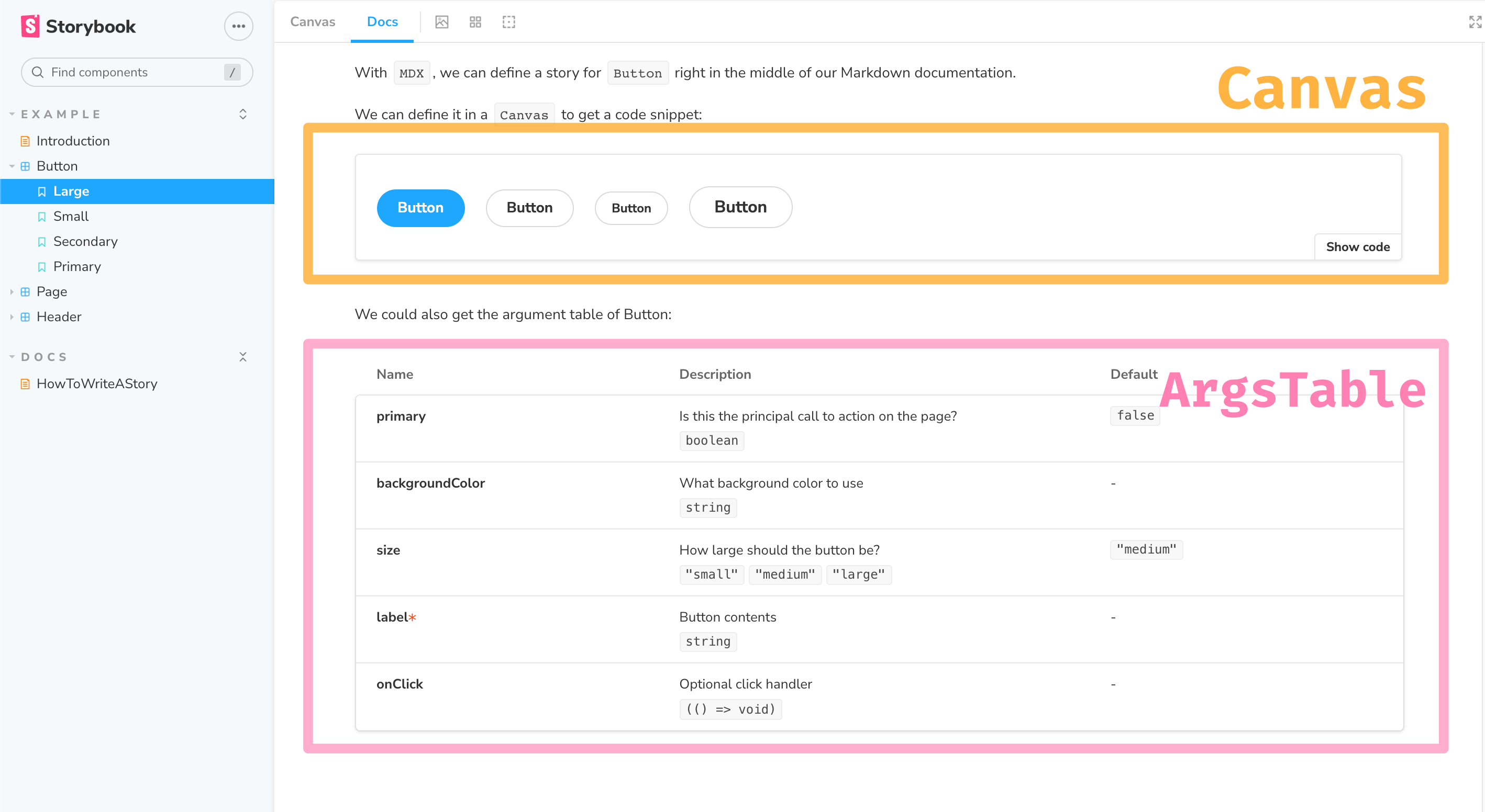
// Button.stories.mdx

import { ArgsTable, Canvas, Meta, Story } from '@storybook/addon-docs';

import { Button } from './Button';

<Meta title="Example/Button" component={Button} />

export const Template = (args) => <Button {...args} />;

# Button

With `MDX`, we can define a story for `Button` right in the middle of our
Markdown documentation.

We can define it in a `Canvas` to get a code snippet:

<Canvas>
  <Story
    name="Primary"
    args={{
      primary: true,
      label: 'Button',
    }}
  >
    {Template.bind({})}
  </Story>
  {/* ... */}
</Canvas>

We could also get the argument table of Button:

<ArgsTable of={Button} />
上述的 MDX 將可以產生如下圖的文件:
嵌入 Story 或建立連結
另外,透過 URL 可以檢��視各個 Canvas 或 Doc 的 URL(ID):

如果有需要的話,也可以在 MDX 的文件中,透過 ID 載入該 Story:
<Story id="example-button--small" />
或連結到特定 Story:
Go to the story of the [Button](?path=/story/example-button--small).
舉例來說,下面的 MDX:
// How.stories.mdx

import { Meta, Story } from '@storybook/addon-docs';

import { Button } from './Button';

<Meta title="Docs/HowToWriteAStory" />

# How to write a story in storybook

Let start with a `.stories.js` file.

<Story id="example-button--small" />

Go to the story of the [Button](?path=/story/example-button--small).
將可以產生對應的文件:

撰寫文件:DocsPage 區塊
DocsPage @ Storybook > DocsPage
如果你只是單純想要建立一份文件放在 Storybook 中可以被檢視,請參考上一個段落的「單純建立一份文件」。
在 Storybook 中,DocsPage 指的是 Docs 區塊的內容,預設就會使用 @storybook/addon-docs 中提供的元件來產生內容:

除了可以使用 xxx.stories.mdx 的方式來同時產生 Canvas 和 DocsPage 中的內容之外,如果你只是想要修改(替換掉)DocsPage 中的內容,而不想動到 Canvas 區塊時,可以使用 parameters.docs.page 的屬性來做到這件事。
自動建立 DocsPage(AutoDocs)
要啟用 AutoDocs 的功能,只需要 Component Level 中加上 autodocs 的屬性即可:
// https://storybook.js.org/docs/react/writing-docs/autodocs
const meta: Meta<typeof Button> = {
  component: Button,
  //👇 Enables auto-generated documentation for the component story
  tags: ['autodocs'],
  argTypes: {
    backgroundColor: { control: 'color' },
  },
};
客製化 DocsPage
如果想要替換的話,可以透過 parameters.docs.page 的屬性來修改,像是換成使用 MDX 自己寫文件,或者關掉 DocsPage 等等。
調整 DocsPage 中預設顯示的內容和順序
DocsPage 本身其實就是由 React 元件組成,如果需要修改這個 React 元件只需透過 parameters.docs.page 來修改:
// Button.stories.tsx

export default {
  title: 'Button',
  component: Button,
  parameters: {
    docs: {
      // page: JSX 元件
      page: () => <>...</>,
    },
  },
};
如果想要修改原本 DocsPage 顯示的內容或順序,可以載入 @storybook/addon-docs 中提供的元件來自行調整:
// Button.stories.ts|tsx
// ...

import {
  Title,
  Subtitle,
  Description,
  Primary,
  ArgsTable,
  Stories,
  PRIMARY_STORY,
} from '@storybook/addon-docs';

export default {
  title: 'Button',
  component: Button,
  parameters: {
    docs: {
      page: () => (
        <>
          <Title />
          <Subtitle />
          <Description />
          <Primary />
          <ArgsTable story={PRIMARY_STORY} />
          <Stories />
        </>
      ),
    },
  },
} as ComponentMeta<typeof Button>;
使用 React 元件(JSX、TSX)
除了可以使用 MDX 來撰寫 DocsPage 外,也可以直接使用 React 元件(即,JSX、TSX),例如:
// ButtonDocumentation.tsx
const CustomDocumentationComponent: React.VFC<{}> = () => {
  return (
    <div>
      <h1>Replacing DocsPage with a custom component</h1>
      <p>
        The Docs page can be customized with your own custom content written as a React Component.
      </p>
      <p>Write your own code here👇</p>
    </div>
  );
};

export default CustomDocumentationComponent;
接著一樣在 .stories 檔中在 parameters.docs.page 屬性使用此�撰寫好的 React 元件:
// Button.stories.tsx
// ...
import ButtonDocumentation from './ButtonDoc';

export default {
  // ...
  parameters: {
    docs: {
      page: ButtonDocumentation,
    },
  },
} as ComponentMeta<typeof Button>;
使用 MDX
在 Storybook 中,可以使用 MDX 來撰寫 DocsPage 的內容。這裡是使用 MDX 來取代 DocsPage 中的內容,而不是使用 MDX 來建立 Stories 檔案,因此仍然需要建立 .stories 檔,並在 .stories 中指定要在 DocsPage 中使用的文件。
在 Storybook 中也可以使用 MDX 來建立 Stories 檔,例如,Button.stories.mdx,但這裡說明的並不是這種使用情境。
1. 建立 MDX 檔案
首先需要建立 MDX 的文檔(檔名可以自取),在 MDX 的檔案中,可以使用 id="group-subgroup-...--name" 來載入 .stories 中寫好的 story(參考 grouping 文件中說明)。
舉例來說,有一個 Button 的元件,它的 .stories 如下:
- default export 中的
title欄位會定義 group 的名稱,這裡是Example/Button - Named export 的變數名稱則是 name 的名稱(除非有用參數修改名稱),這裡是
primary
// Button.stories.tsx
import { ComponentMeta, ComponentStory } from '@storybook/react';

import { Button } from './Button';

export default {
  title: 'Example/Button',
  component: Button,
  //...
} as ComponentMeta<typeof Button>;

const Template: ComponentStory<typeof Button> = (args) => <Button {...args} />;

export const Primary = Template.bind({});
Primary.args = {
  primary: true,
  label: 'Button',
};
根據 .stories 中的 title 和 name,如果需要在 MDX 中使用這個 story 檔,則可以使用 <Story id="example-button--primary" /> 在 MDX 中顯示該元件:
// Button.mdx

import { Story } from '@storybook/addon-docs';

### Primary

<Story id="example-button--primary" />
2. 在 .stories 中修改顯示的 DocsPage
建立好 MDX 後(例如,Button.mdx)後,需要在 Button.stories.tsx 中透過 parameters.docs.page 屬性中修改要用來顯示 DocsPage 的元件:
// Button.stories.tsx
import { ComponentMeta, ComponentStory } from '@storybook/react';

import { Button } from './Button';

// 載入寫好的 MDN 文件
import ButtonDocumentation from './Button.mdx';

export default {
  title: 'Example/Button',
  component: Button,
  // 使用 parameters.docs.page 來改成用 MDN 顯示 DocsPage
  parameters: {
    docs: {
      page: ButtonDocumentation,
    },
  },
} as ComponentMeta<typeof Button>;
如此,當使用者在檢視 DocsPage 時,就會看到寫好的 MDX 文件,以及在 MDX 中載入的 Story:

關掉 DocsPage
如果不想要顯示 DocsPage 區塊,可以把 parameters.docs.page 設成 null:
// Button.stories.tsx

export default {
  // ...
  parameters: {
    docs: {
      page: null,
    },
  },
};
Inline stories vs. iframe stories
預設的情況下,在 DocsPage 中 Story 的顯示會用 inline 的方式來顯示:

如果因為某些原因需要改成使用 iframe 來呈現,則可以透過 parameters.docs.inlineStories 屬性來修改:
// 同樣可以設定在 global、component、或 story level

const parameters = {
  docs: {
    // Opt-out of inline rendering
    inlineStories: false,
  },
};
如此在 DocsPage 中就會改成使用 iframe 的方式來顯示該 Story:

Automated Testing
Snapshot Testing
snapshot testing @ storybook > tutorials
透過 addon-storyshots,它會自動幫每一個 stories 建立 snapshot test。
yarn add -D @storybook/addon-storyshots react-test-renderer
建立名為 src/storybooks.test.js 的檔案:
import initStoryshots from '@storybook/addon-storyshots';

initStoryshots();
Unit Tests with React Testing Library
Unit tests with React Testing Library @ storybook > tutorials
透過 @storybook/testing-react 這個 addon,可以讓你將 Storybook 中寫好的 stories 在 unit tests 中可以被重複使用。你只需要選擇要在 unit test 中去 render 那一個寫好的 story:
// 將 Storybook 中寫好的 stories 在 unit tests 中可以被重複使用
import { composeStories } from '@storybook/testing-react';
import { render, screen } from '@testing-library/react';

import * as TaskListStories from './TaskList.stories';

// compose stories 會處理所有和此 story 所需的資訊(例如 args)
const { WithPinnedTasks } = composeStories(TaskListStories);

it('renders pinned task at the start of the list', () => {
  render(<WithPinnedTasks />);
  const listItems = screen.getAllByRole('textbox');
  expect(listItems[0].value).toEqual('Task 6 (pinned)');
});
Visual Regression Test
Visual testing for Storybook @ storybook > tutorial
Visual regression tests 又稱作 visual tests,這種類型的測試會對 UI 進行 screenshots(不是 snapshot!),接著比對每一次 screenshots 有沒有變化,主要目的是用來偵測外觀的變化,包括 layout、顏色、尺寸、對比等等。
Global Configuration
設定檔
.storybook/preview.js
設定 storybook 中 render 區塊的全域參數(例如,parameters、decorators)。
.storybook/main.js
針對 storybook 本身的設定,例如,webpack、babel。
.storybook/manager.js
- Features and behavior @ Configuration > User interface
針對 manager 的修改可以在這:
// .storybook/manager.js

import { addons } from '@storybook/addons';
import { themes } from '@storybook/theming';

addons.setConfig({
  // https://storybook.js.org/docs/react/configure/features-and-behavior
  // ...
  // https://storybook.js.org/docs/react/configure/theming
  theme: themes.dark,
});
.storybook/preview-head.html
添加程式在 preview iframe 中的 <head></head> 中。
.storybook/preview-body.html
添加程式(例如,HTML Tag 或 CSS 樣式)在 preview iframe 的 <body></body> 中。
升版與降版
使用 npx sb upgrade 會將專案中所有和 Storybook 有關的套件都升級到最新的版本,如果想要退版的話,則需要自己手動 package.json 中的版號。
Integration
Webpack
webpack @ Configure > Integration > Webpack
Storybook 中的 webpack 預設就可以處理:
- 在 JS 中載入圖片和靜態檔
- 在 JS 中載入 JSON 檔
如果要修改 Storybook 中 webpack 的設定,只需要透過 .storybook/main.js 中 webpackFinal,它會是一個 async function,在這個 function 中可以取得原本的 webpack 設定,並需要回傳修改後的 webpack 設定:
// https://storybook.js.org/docs/react/configure/webpack
// Export a function. Accept the base config as the only param.
module.exports = {
  webpackFinal: async (config, { configType }) => {
    // `configType` has a value of 'DEVELOPMENT' or 'PRODUCTION'
    // You can change the configuration based on that.
    // 'PRODUCTION' is used when building the static version of storybook.

    // Make whatever fine-grained changes you need
    config.module.rules.push({
      test: /\.scss$/,
      use: ['style-loader', 'css-loader', 'sass-loader'],
      include: path.resolve(__dirname, '../'),
    });

    // Return the altered config
    return config;
  },
};
要留意的是,除非開發者覆蓋掉整個 webpack 檔,否則這個設定只會套用在 Storybook 中的 preview(render)區塊,而不會影響到 manager 區塊。
如果你想要套用專案中已經寫好的 webpack 設定,則可以這麼做:
// https://storybook.js.org/docs/react/configure/webpack
// .storybook/main.js

// your app's webpack.config.js
const custom = require('../webpack.config.js');

module.exports = {
  webpackFinal: async (config) => {
    return { ...config, module: { ...config.module, rules: custom.module.rules } };
  },
};
TypeScript
如果 Storybook 中預設的 webpack 沒辦法解析 tsconfig 中 module alias 的設定,可以參考這裡的設定 TypeScript Module Resolution。
Babel
如果專案中本來就有 .babelrc 的檔案,Storybook 會自動套用這個 babel 而不會使用 Storybook 內的預設的 babel config,但如果你有專門針對 Storybook 要使用的 babel 則可以把檔案建立在 .storybook/.babelrc。
如果專案中本來就沒有自己的 babel 設定檔,則 Storybook 會使用預設的設定檔,如果想要針對這個預設的設定進行調整,可以在 .storybook/main.js 中透過 babel 欄位加以客製化:
// https://storybook.js.org/docs/react/configure/babel#custom-configuration
// .storybook/main.js

module.exports = {
  stories: [],
  addons: [],
  babel: async (options) => ({
    ...options,
    // any extra options you want to set
  }),
};
另外,如果專案需要的話,Storybook 也提供指令產生一組 babel 設定檔:
$ npx sb@next babelrc
如果想要檢視 Storybook 當前套用到的 babel 設定檔,則可以使用下述指令,但這個指令只能檢視設定,不能實際啟動 storybook:
# 只能檢視設定,不能實際啟動 storybook
BABEL_SHOW_CONFIG_FOR=.storybook/preview.js yarn storybook
User Interface
Features and behavior @ Configure > User interface
Theming
Theming @ Configure > User interface
如果是要修改 manager 的 theme,可以在 .storybook/manager.js 中透過 theme 屬性加以修改;如果是要修改 docs 的 theme,則是在 .storybook/preview.js 中,透過 parameters.docs.theme 加以修�改。
Sidebar & URLS
Storybook 建議根據實際檔案的路徑來命名 .stories 檔中的 title 屬性,舉例來說:
- 元件:components/modal/Alert.tsx
- Stories:components/modal/Alert.stories.tsx
- Stories 中的 title:Components/Modal/Alert
Addons: Controls
- How to connect props with Storybook controls @ Youtube
- Controls @ Storybook > Essential addons
- ArgTypes @ Storybook > API > Stories
Control 的部分有兩個地方可以調整:
- 如果是針對每個 props 各自的 controls 要調整,則可以透過
argTypes中的 control annotations 來調整,即argTypes[propName].control(單數) - 如果是要針對 control addon 整體外觀的調整,則是透過
parameters參數,即parameters.controls(複數)
啟用 Controls
如果改元件沒有設定啟用 Controls 的話,在 Storybook 中會出現這樣的提示「This story is not configured to handle controls」,這表示使用者無法透過下方的 UI 直接去改變元件的 props:
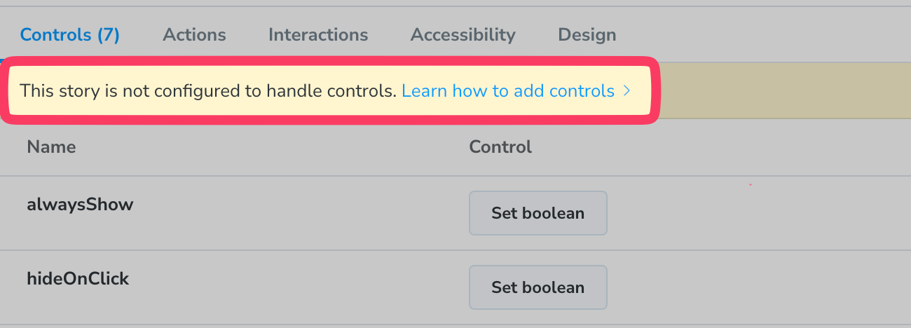
要啟用 controls 的方式很簡單,有兩種方式:
使用 component field
// Tooltip.stories.tsx
import type { Meta, StoryObj } from '@storybook/react';

import { Button } from './Button';

const meta: Meta<typeof Tooltip> = {
  // 使用 "component" field 會自動偵測裡面的 controls
  component: Button,
};

export default meta;
type Story = StoryObj<typeof Button>;

export const Placement: Story = {
  // 改變 args
  args: {
    size: 'lg',
  },
};
使用 args 做更多客製化
如果我們針對 controls 的項目做更客製化的設定,例如,這個元件是有多個不同的元件組合起來時,則可以利用 args 這個參數:
// Tooltip.stories.tsx
import type { Meta, StoryObj } from '@storybook/react';

import { Tooltip } from './Tooltip';

const meta: Meta<typeof Tooltip> = {
  component: Tooltip,
};

export default meta;
type Story = StoryObj<typeof Tooltip>;

export const Placement: Story = {
  // 這裡面定義的內容會被放到下面 render 的 args 中
  args: {
    placement: 'right',
  },
  // 上面 args 的內容會被放到 args 的參數中
  render: (args) => {
    <Tooltip label="Here is a tooltip" {...args}>
      <Button disabled={args.disabled}>Action</Button>
    </Tooltip>;
  },
};
argTypes and control annotations
進一步設定 controls 的顯示
透過 argTypes 的設定,可以調整 control 中用來設定不同參數的 UI,例如我們想要設定 size 這個 props 在 control 中的顯示方式:
// Button.stories.tsx
import type { Meta } from '@storybook/react';
import { Button } from './Button';

const meta: Meta<typeof Button> = {
  component: Button,
  argTypes: {
    // 針對 "size" 這個參數使用 radio button 的方式來呈現,並且放入選項
    size: {
      options: ['small', 'medium', 'large'],

      control: {
        // 想要顯示的類型
        type: 'radio',

        // 如果想要改變 option 在 UI 上 label 的顯示名稱
        labels: {
          small: 'sm',
          medium: 'md',
          large: 'lg',
        },
      },
    },
  },
};

export default meta;
在 Control 的 UI 則會像這樣:

根據不同的資料類型(Data Type)可以選擇使用不同的 Control Type 來呈現,可以參考官網 Control Annotation 的說明(如下圖):

上圖中的 Control Type 指的是可以放入 argTypes.[propsName].control.type 中的選項,前面的 Data Type 則是這個 Control Type 適合用來控制的資料類型。
舉例來說,size 這個 props 有三種不同的選項(small, medium, large),因此 Data Type 屬於 enum,同時又是單選,因此比較適合的應該是 radio, inline-radio, select 這些 Control Type(雖然你還是可以把 control.type 設定成 text 來呈現)。
有些 Control Type 提供了額外的參數可以設定,例如 number 就還可以帶入 min、max、step 等等:
export default {
  // ...
  argTypes: {
    width: {
      control: { type: 'range', min: 400, max: 1200, step: 50 },
    },
  },
};
關閉某個 props 的 control
把 control 設為 false 的話,在 Control Panel 中仍然會顯示該 props 的名稱,但不會有 control 可以調整:
// Button.stories.tsx
export default {
  // ...
  argTypes: {
    size: {
      control: false,
    },
  },
} as ComponentMeta<typeof Button>;
如下圖:

在 controls 中隱藏 props
如果你不只是想要關掉某個 props 的 control,而是希望在 control 中連該 props 的名稱都不要顯示的話,則可以透過設定 argTypes[propName].table.disabled,像是這樣:
// Button.stories.tsx
export default {
  // ...
  argTypes: {
    // 在 Controls Panel 中不要顯示 size 這個 props
    size: {
      table: {
        disable: true,
      },
    },
  },
} as ComponentMeta<typeof Button>;
Parameters
在 Control 面板中顯示詳細的 props 資訊
如果想要讓 Control 中顯示的項目和 Docs panel 中顯示的一樣豐富(例如,包含 default value 和 description),可以調整全域設定中的 parameters.controls.expanded:
// .storybook/preview.js

export const parameters = {
  controls: {
    expanded: true,
  },
};
篩選在 controls 中顯示的 props
除了可以透過 argTypes 中的 table 來決定要不要顯示特定的 props 外,也可也透過 parameters.controls 來設定(可以設定在 component 或個別的 story):
// Button.stories.tsx
export default {
  // ...
  parameters: {
    controls: {
      include: ['foo', 'bar'], // 只會顯示名稱為 foo, bar 這兩個 props
      include: /^hello*/, // 只會顯示名稱以 hello 開頭的 props
      exclude: ['foo', 'bar'], // 不顯示名稱為 foo, bar 這兩個 props
      exclude: /^hello*/,
    },
  },
};
排序 controls
使用 parameters.controls.sort 可以選擇 props 要排序的方式(例如,requiredFirst):
// Component.stories.jsx

export default {
  // ...
  parameters: { controls: { sort: 'requiredFirst' } },
};
Addons: Actions
- Actions @ storybook > Essentials Addons
- Advanced/Legacy Actions Usage
如果想要主動觸發 action 可以使用 @storybook/addon-actions:
action('<message>'):會回傳一個 event handler function,該 function 被執行後才會觸發該 action
import { action } from '@storybook/addon-actions';

const handleClick = action('user clicked');

export const BasicButton = () => <Button onClick={handleClick} />;
Other Docs
Storybook on-demand architecture
Storybook on-demand architecture @ Storybook Blog
在 Storybook v6.4 後開放 storybook on-demand 的功能,這個功能在 v7 會變是預設的。
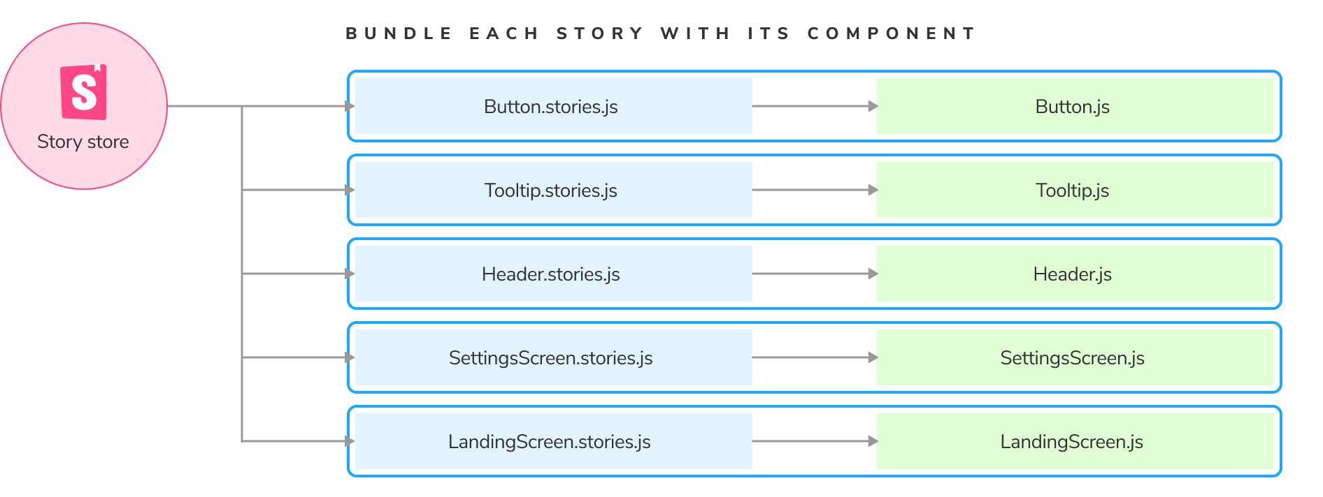
傳統的 Storybook 會把所有的 stories (CSF files)、元件本身、用來渲染 storybook 的程式,以及 storybook runtime 都打包在一起,因此這隻檔案的 bundle size 會非常大,且影響載入時間:

因此如果可以把 bundle size 切小,等於速度就會越快。
Storybook on-demand 的功能就是企圖做到
- code-splitting
- smart file system caching
- lazy compilation:只打包渲染當前畫面所需內容
啟用 Storybook on-demand 功能後,Storybook 不會在 bundle 的時候打包整個 App,而是只打包使用者正在使用會需要用到的部分,其餘的部分都透過非同步的方式加以載入。實際的作法上每個 CSF 都會產生自己的 bundle 檔,這個 bundle 檔中會包含「元件本身」、用來載入及渲染該 story 的最小區塊:
常見問題與情境
在 Component 中修改 args
- useArgs @ Addons > Addon API
- @storybook/store @ github
- useArgs throws exception when used with Story Function @ Github Issue
@storybook/client-api 和 @storybook/api 都有 useArgs() 這個 API,但前者是給 preview 用的,後者是給 manager 用的嗎,透過 useArgs() 即可在 component 中修改 args 的值:
// ...
// STEP 1: import useArgs from @storybook/client-api
import { useArgs } from '@storybook/client-api';

import PureAlertModal from '.';

export default {
  title: 'components/Modal/AlertModal',
  component: PureAlertModal,
} as ComponentMeta<typeof PureAlertModal>;

export const AlertModal: ComponentStory<typeof PureAlertModal> = ({ onClose, ...args }) => {
  // STEP 2: use the methods provided from useArgs
  // const [args, updateArgs, resetArgs] = useArgs();
  const [, updateArgs] = useArgs();

  const handleOpen = () => {
    updateArgs({ show: true });
  };
  const handleClose = () => {
    updateArgs({ show: false });
  };

  return (
    <div>
      <button onClick={handleOpen}>Open</button>
      <PureAlertModal onClose={handleClose} {...args} />
    </div>
  );
};

AlertModal.storyName = 'AlertModal';
AlertModal.args = {
  t: (key: string) => key,
  id: 'alert-modal',
  i18nKeyTitle: 'Title',
  i18nKeyDescription: 'Description',
  i18nKeyCloseButtonText: 'Close',
  show: false,
};
讓 Sidebar 的 Categories 長的和專案資料夾一致
Make categories look like folders @ Youtube
// .storybook/manager.ts
import { addons } from '@storybook/manager-api';

addons.setConfig({
  sidebar: {
    showRoots: false,
  },
});